








PLACE BRANDING, WAYFINDING & HERITAGE
Wiedemann Lampe’s new identity for Gunnersbury Park and Museum turns an overlooked London destination into a place that is easier to recognise, navigate and remember.
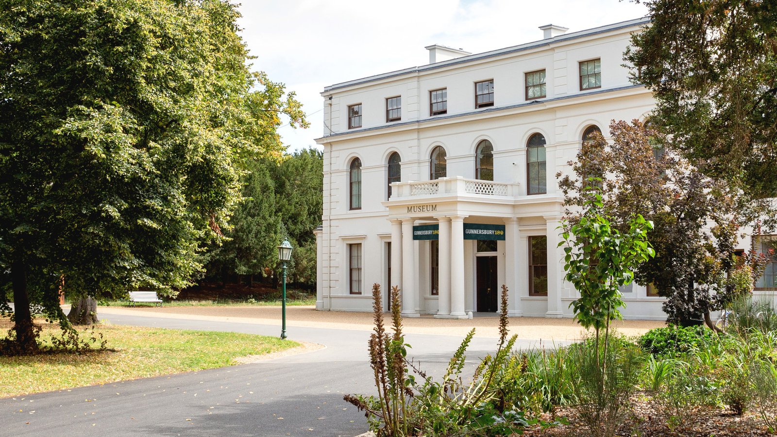
A cultural landmark cannot welcome new audiences if people do not realise it is there. That was the curious problem at Gunnersbury: Londoners might recognise the park, recall its lake or remember a childhood visit, yet the museum within the grounds remained surprisingly easy to miss.
The setting is hardly short of interest. Across 72 hectares jointly owned by Ealing and Hounslow councils, visitors can encounter historic buildings, sport, gardens and a museum devoted to local stories. The park opened to the public in 1926, and Gunnersbury Park Museum followed in 1929. The difficulty was explaining how those experiences relate. Park and museum occupy one destination, but they have different programmes and visitor experiences.
Wiedemann Lampe therefore had to create clarity without forcing the park and museum into a single voice. Its response treats them as close relatives: each offer can speak independently, while a shared visual grammar makes their connection immediately apparent. That principle gives Gunnersbury a coherent public face without erasing the reasons someone might visit one part rather than the other.
One Destination, Two Voices
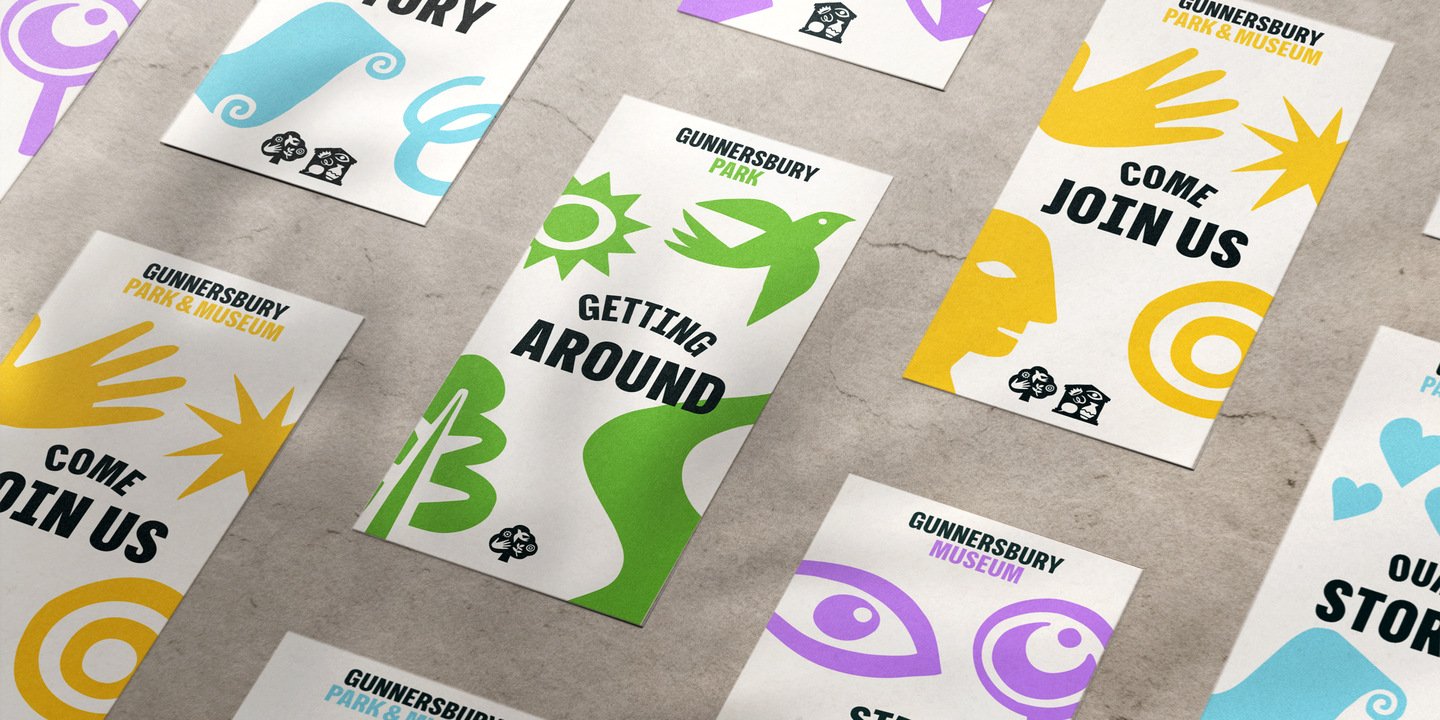
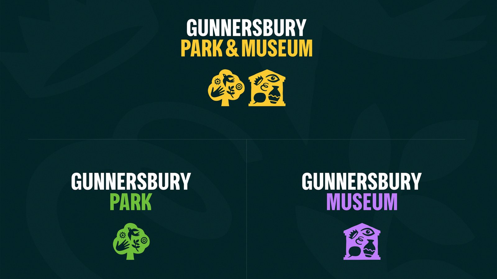
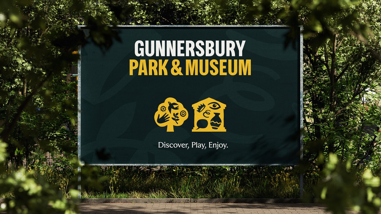
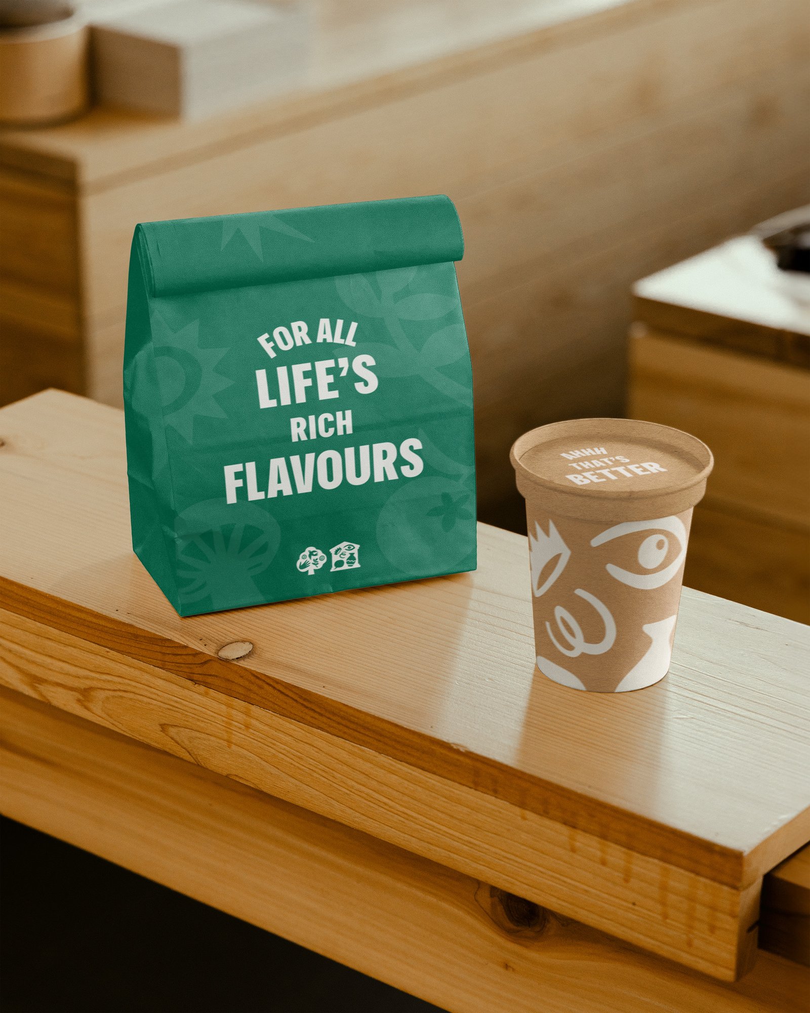
Two emblems make the relationship understandable. A stylised tree identifies the park, while a gabled structure represents the museum. Look closer and both contain a lively collection of smaller forms—among them birds, hands, ceramics and an eye—that suggest nature, making and discovery without reducing the place to a literal inventory.
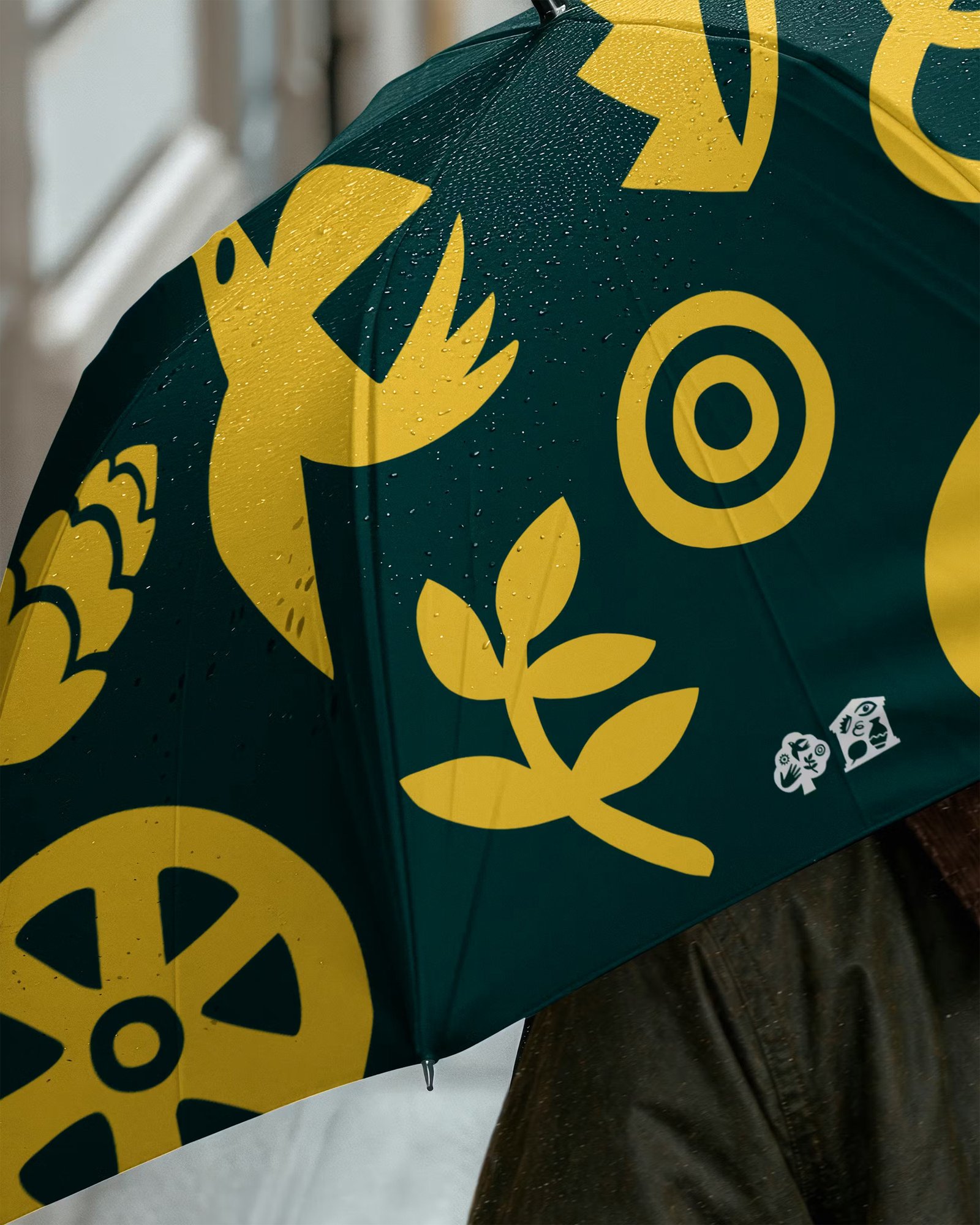
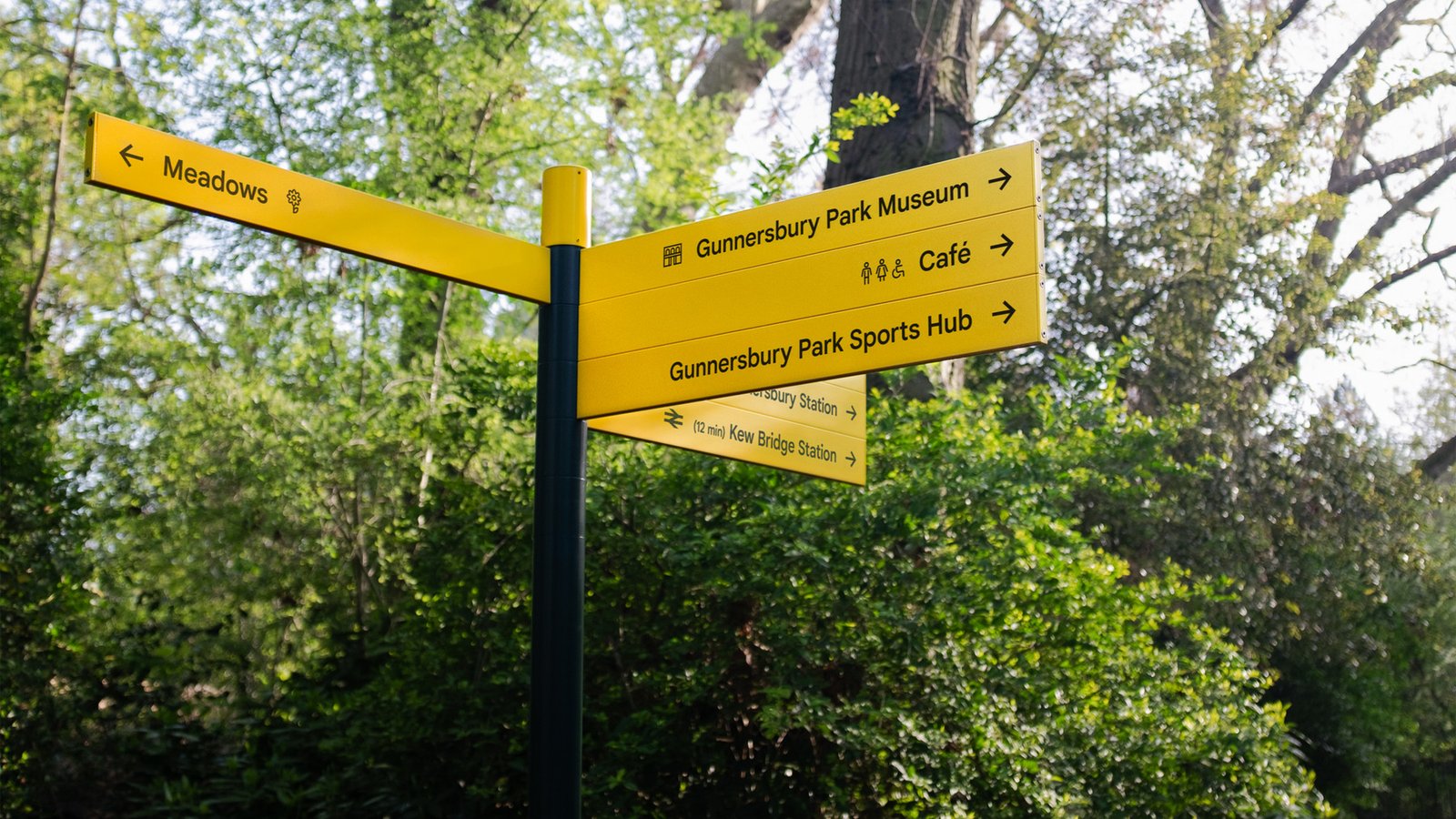
Colour establishes the next layer of order. Green signals the park; purple belongs to the museum. When both appear under the wider Gunnersbury banner, yellow becomes the unifying voice. The same high-visibility hue extends into signs around the estate, so the brand logic learned on a leaflet remains useful when a visitor is choosing a path.
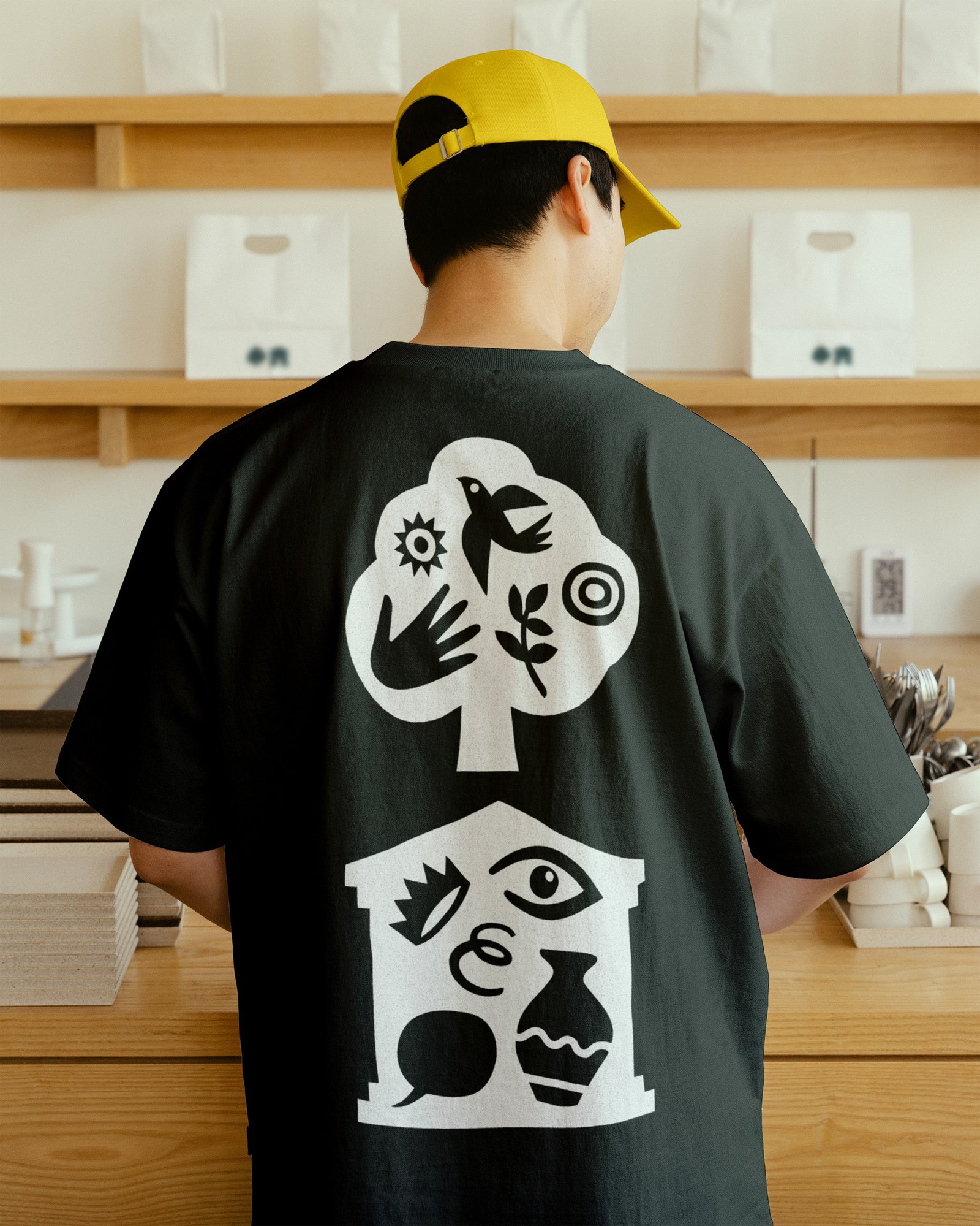
This is more than a palette applied to one master logo. The components can separate, recombine and change emphasis according to the message. An exhibition need not borrow the park’s entire personality, and an outdoor event can lead with its own character. Joint communications still feel complete because neither half is visually treated as an afterthought.
That flexibility matters for a destination whose ambitions have expanded faster than its old presentation. Gunnersbury Estate (2026) CIC operates as the trading subsidiary of the Gunnersbury Museum and Park Development Trust, so the identity needs to help a small team communicate a broad offer rather than add complexity. Modularity gives staff a practical toolkit, not merely an attractive launch campaign.
Character Without the Civic Clichés
The strategy is gathered around the phrase “Life’s Rich Tapestry.” In less careful hands, that broad sentiment could produce generic photographs of happy crowds and polished landscapes. Here it becomes a prompt to notice the particular. Rather than selling an idealised park, the system builds interest from the activities, objects, wildlife and encounters already present at Gunnersbury.
The photography follows people at a human scale instead of relying on sweeping scenery alone. Alongside it, artist Rebecca Sutherland developed illustrations that draw on changing seasons, natural life, collection objects and cultural events. Their specificity gives the identity warmth, while their shared construction keeps a diverse set of subjects recognisably part of one place.
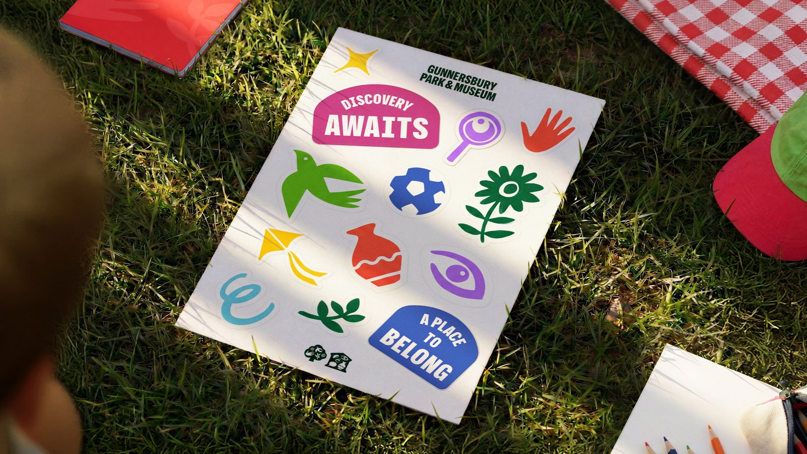
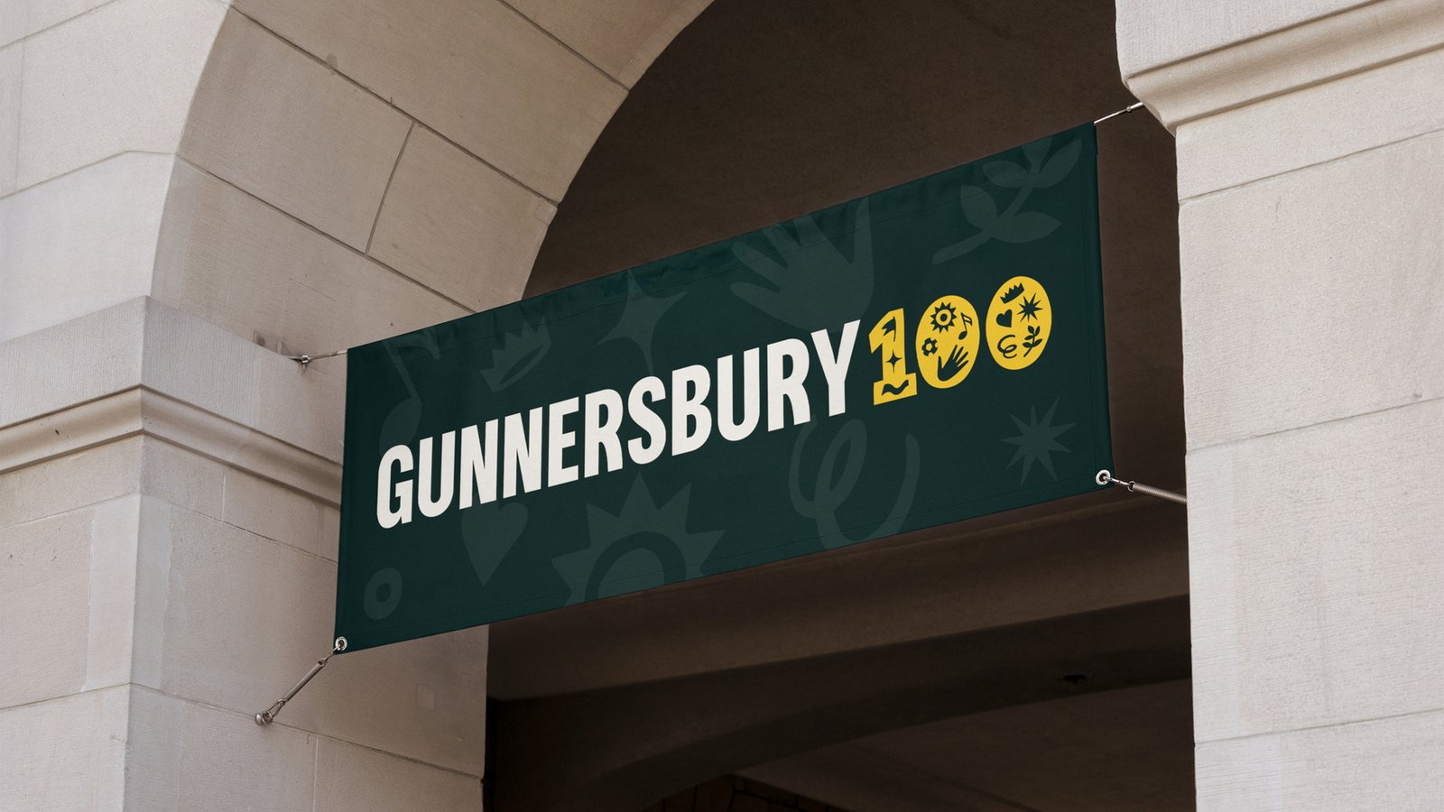
Crucially, those drawings form an expandable vocabulary rather than a single centrepiece. New programmes can introduce new motifs without requiring the organisation to discard its visual world and begin again. The approach also allows the Gunnersbury 100 mark—commemorating a century since the park opened to the public in 1926—to sit beside the core identity without turning a temporary celebration into the permanent brand.
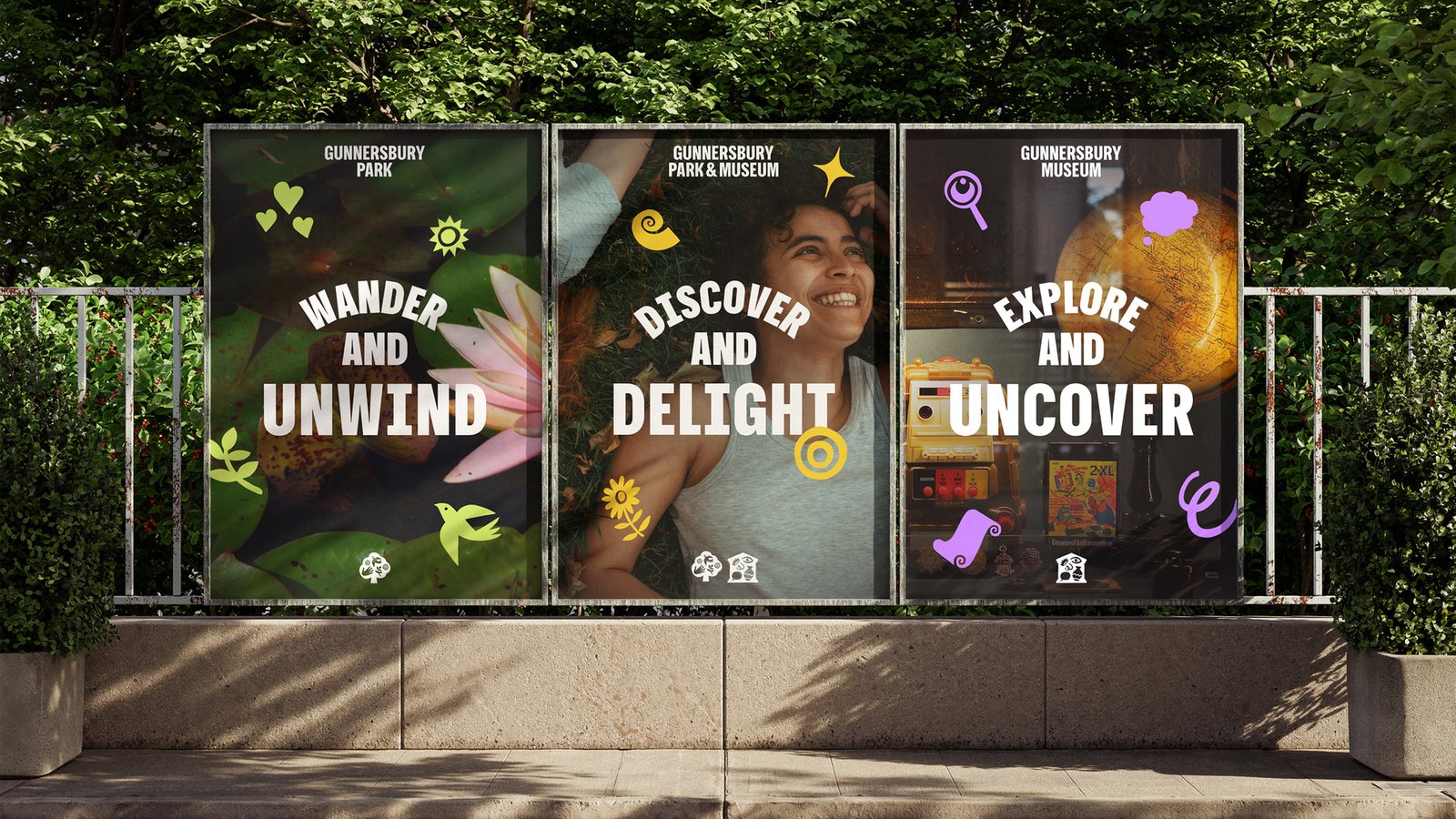
That distinction is valuable for museums and public spaces, where the programme is always evolving but recognition must accumulate slowly. A fixed hero image can date as soon as tastes or priorities change. A family of compatible elements makes room for growth while preserving enough repetition for audiences to know who is speaking.
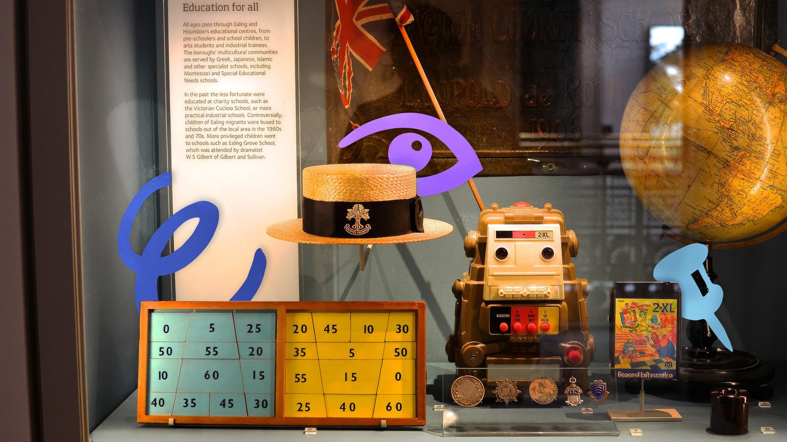
Signs That Support Exploration
When the graphic language enters the landscape, its task becomes practical. Large parks create uncertainty through branching paths and hidden destinations, especially for newcomers. Gunnersbury’s yellow wayfinding answers that uncertainty with bold type and readily understood icons, bringing the museum, café, sports hub and transport connections into view at useful decision points.
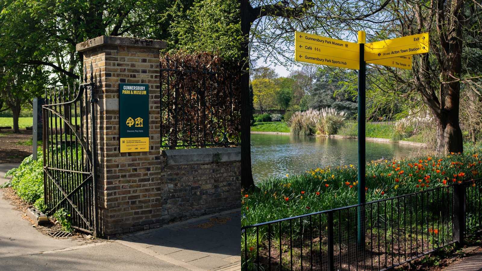
The signs offer choices rather than prescribe an itinerary. Visitors can see what is available, judge the direction and create their own route. For a place that wants to feel communal and inclusive, this light touch is important: orientation supports curiosity, whereas too much instruction can make discovery feel managed.
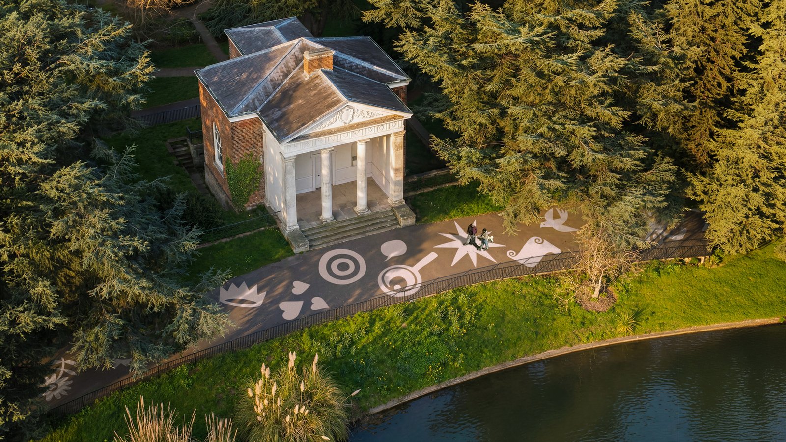
According to the launch account, the wayfinding can be introduced in stages rather than requiring every location to change at once. Because colour, symbols and layout already work as a consistent system, each new installation can strengthen what came before instead of looking like a disconnected patch.
Creative Boom reports that Gunnersbury chief executive officer David Bowler saw the project as galvanising for the organisation’s compact team. That internal effect is meaningful: a public identity is easier to sustain when the people using it understand the idea and see themselves within it. Still, the most revealing evidence will arrive after launch, in whether more visitors recognise the museum and choose to enter.
The lasting measure: Gunnersbury’s rebrand succeeds when the estate feels not only better designed, but more discoverable. Its paired identities, growing visual library and choice-led signs all serve that larger purpose—helping a place marking a century as a public park step confidently into view.