










HOME · PAINT & COLOR
From creamy neutrals to blue-greens and eggplant, these expert-backed shades can soften or spotlight oak cabinetry without fighting the wood’s natural warmth.
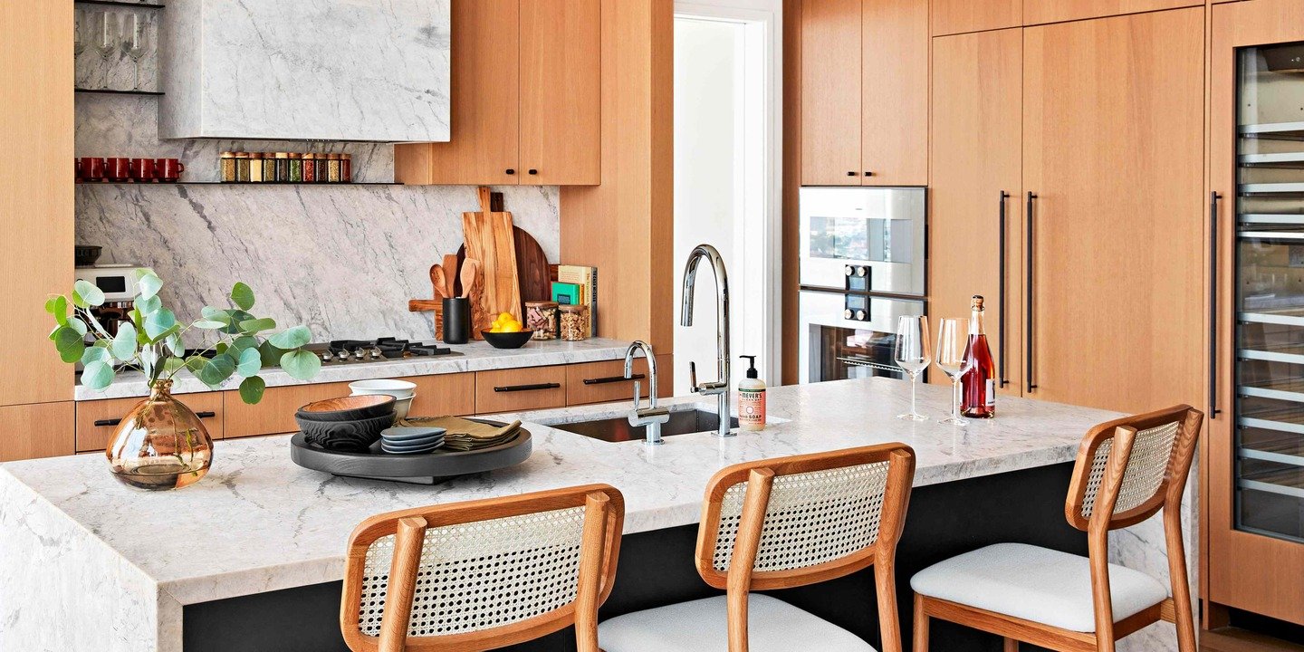
Oak cabinetry is moving beyond its 1990s reputation. Honeyed finishes are resurfacing alongside pale white oak, and either can look intentional when the wall color respects the grain. Paint can quiet orange notes, spotlight golden figuring, or keep lighter wood from looking washed out. Before choosing a swatch, decide whether the cabinets should lead the room or settle into the background. That choice matters more than any trend.
Warmth is the common thread. Color specialist Amy Wax explains that natural wood generally relates best to hues with warmth of their own, a category much broader than beige. Cream, wheat, softened blue, muted green, brown, and even purple can work when their undertones prevent an icy pairing. A cool gray chosen alone may turn unexpectedly sharp beside oak, while a warmer version can connect walls, counters, and cabinetry.
Study the stain before comparing paint chips. Architectural color consultant Amy Krane notes that honey oak usually carries clear yellow-orange notes, red oak can lean rosier, and white oak tends to appear quieter. Lighting changes those signals throughout the day, so judge samples directly beside a cabinet door rather than under store lights. The same paint may feel balanced in morning sun and noticeably cooler after dark.
Contrast determines whether the wood advances or recedes. Blue and green sit opposite honeyed orange on the color wheel, so they sharpen that warmth and make cabinetry more visible. Neighboring colors—yellow, rust, terracotta, and red—reduce the distance and can make the same wood feel calmer. Neither route is automatically modern or dated; decide whether you want energy between surfaces or a closely blended result.
White oak offers more flexibility because its yellow cast is usually restrained. It can support quiet neutrals, soft color, or a deeper wall without becoming the room’s loudest material. Honey oak asks for more intention, but it is not a flaw to disguise. Treat its warmth as an existing color, then repeat, balance, or deliberately oppose it.
The following ten shades, recommended by Wax, Krane, and paint specialist Celeste Garvey, cover all three strategies. Treat them as starting points, and test large samples beside the cabinet finish, countertop, backsplash, and flooring before committing.
Meet the Source Experts
- Celeste Garvey, Ace Hardware paint specialist
- Amy Krane, Amy Krane Color founder, architectural color consultant, and host of the Let’s Talk Paint Color podcast
- Amy Wax, Can’t Fail Color Schemes author and color specialist
Cafe Au Lait by Benjamin Moore

Start with brown when walls and cabinetry should share a foundation. Cafe Au Lait frames oak’s grain while keeping the palette grounded, especially beside stone, leather, bronze, or natural finishes.
Casa Blanca by Sherwin-Williams
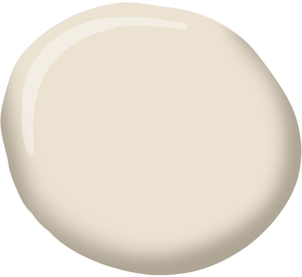
Casa Blanca brightens a room without the chill of stark white. Its creamy, butterscotch-and-linen character supports stained wood and keeps grain distinct. Choose it for a kitchen beside golden or medium-toned oak.
Red Earth by Farrow & Ball

Red Earth is bold but harmonious. Its softened red sits near honey oak’s gold and orange on the color wheel, so the pairing feels layered, not combative. It creates enveloping warmth without harsh contrast.
Palladian Blue by Benjamin Moore
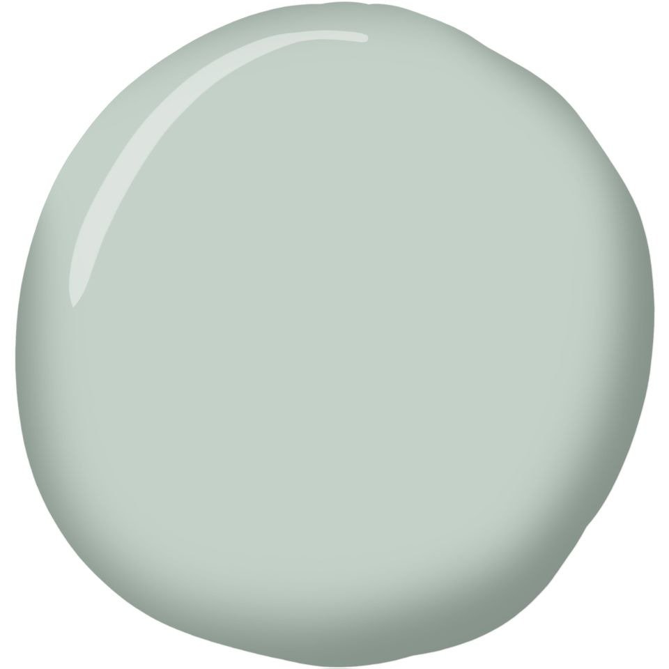
Palladian Blue shows how a cool-looking family can cooperate with warm wood. Garvey favors gentle blue-greens that introduce contrast without severity. This shade brings freshness, enriches oak, and suits a calm, light-filled kitchen.
Caen Stone by Sherwin-Williams
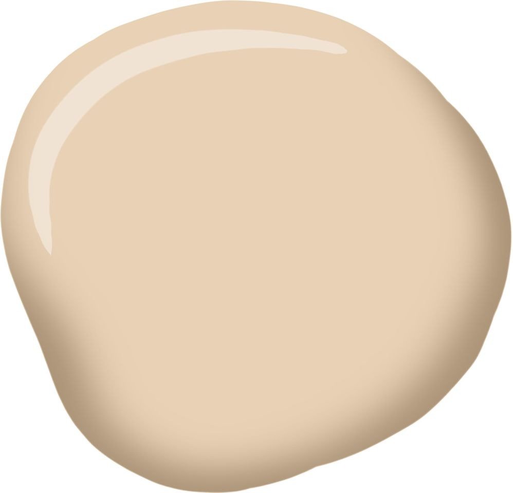
Caen Stone is a peach-leaning neutral for rooms needing warmth and light. It echoes oak’s gold and smooths the wall-to-wood transition, particularly when counters or floors contain cream, sand, or terracotta.
Brinjal by Farrow & Ball
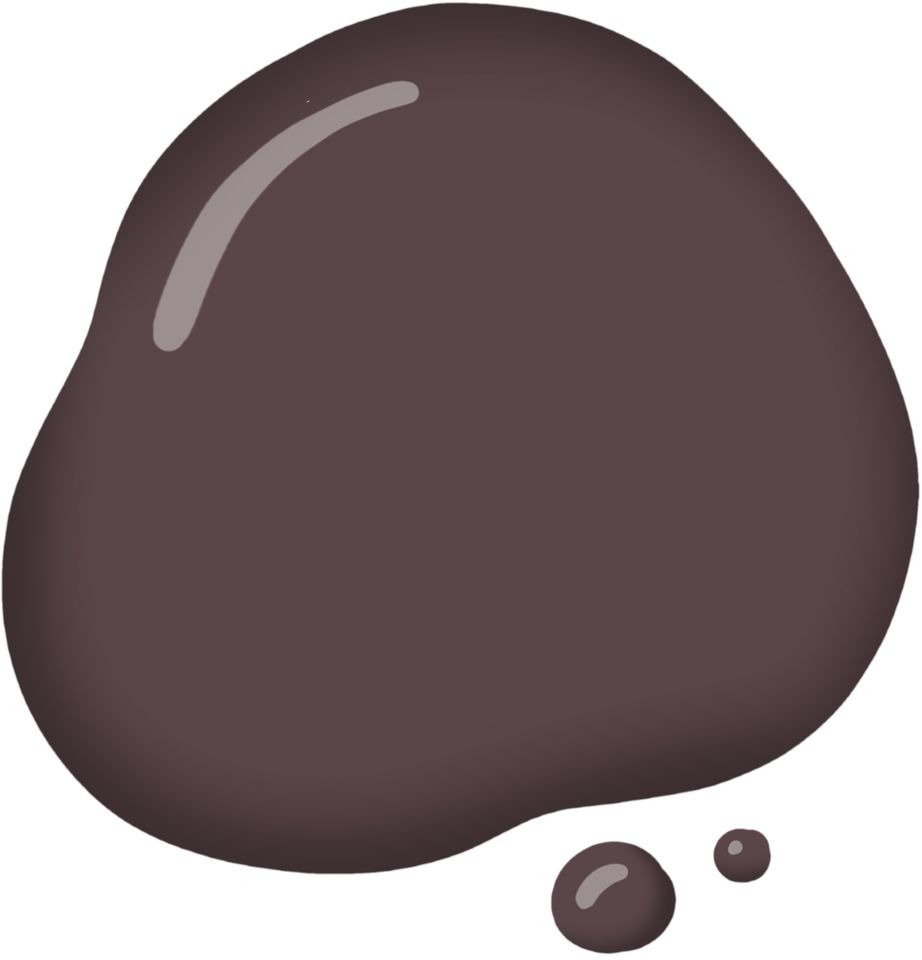
For a change of mood, Brinjal leaves pale neutrals for saturated eggplant. Krane’s purple direction gives oak a dramatic backdrop, while its red undertone still relates to the wood. Pair it with daylight and light counters.
French Canvas by Benjamin Moore

French Canvas returns to a restrained, vanilla-like neutral. It supports oak without competing with grain, useful when patterned stone or a detailed backsplash commands attention. Softer than pure white, it makes wall and cabinet meet gracefully.
Bonsai Tint by Sherwin-Williams

Bonsai Tint introduces green with a yellow undertone that speaks to honey oak. The relationship feels natural and low-key, like foliage beside wood. It offers freshness without blue-green contrast or a dark statement.
Lakeside by Sherwin-Williams
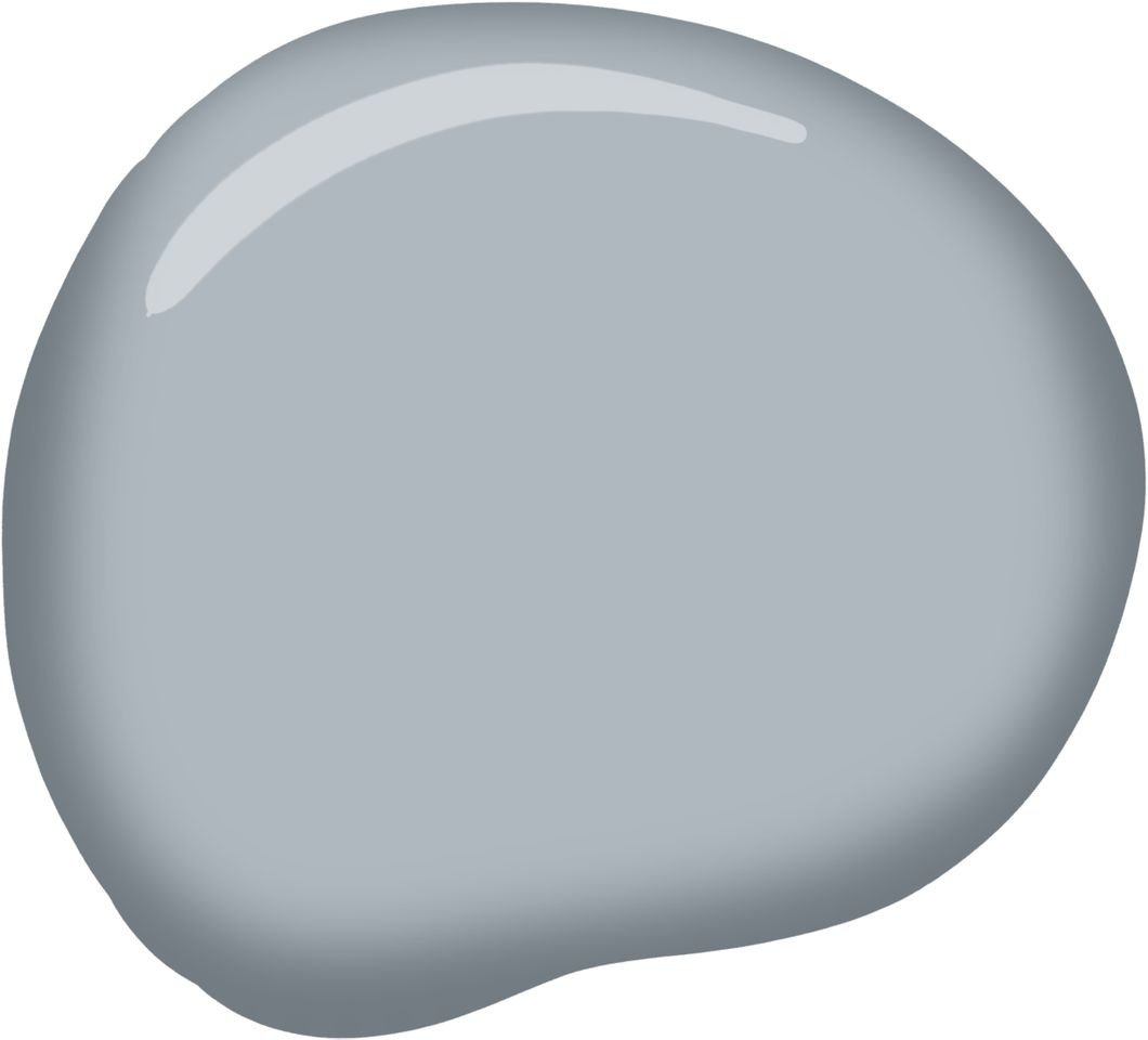
Lakeside is the group’s blue, tempered by gray so it stays composed. Its muted quality prevents excessive contrast while outlining oak’s warmth. Consider it for a serene kitchen needing definition beside white or pale stone.
Concord Ivory by Benjamin Moore
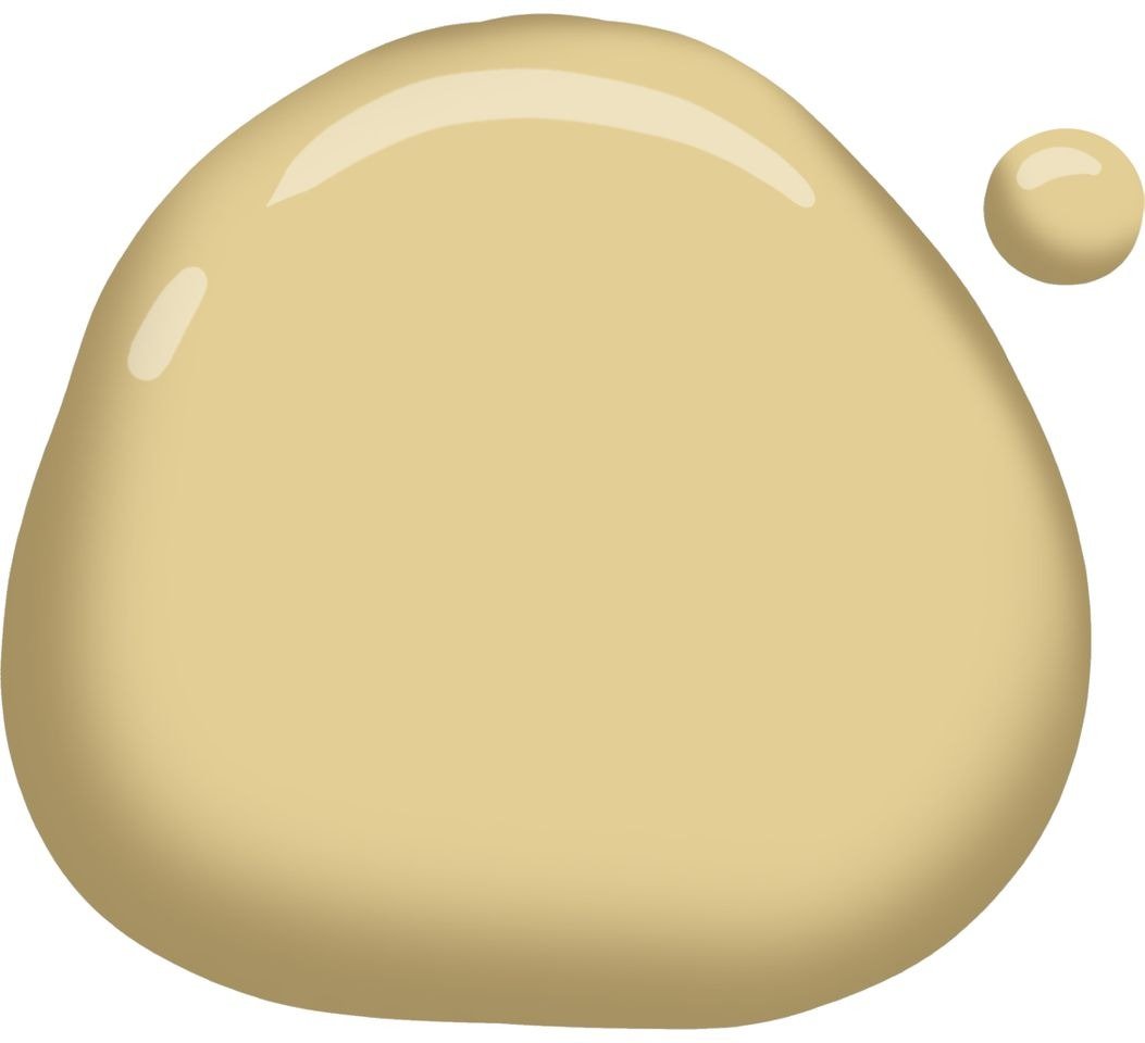
Despite its name, Concord Ivory reads as golden yellow rather than subdued off-white. Krane recommends it for an upbeat scheme that embraces oak. Repeating sunny notes lets walls and cabinets form a warm field; hardware contrasts.