











BRANDING & SPATIAL DESIGN
London restaurant Wolves of Tokyo shows how a shared brief, an integrated creative team and quiet narrative details can make identity and interiors feel inseparable.
A persuasive hospitality brand is often felt before it is consciously read. Instead of relying on one spectacular gesture, it gathers force through a sequence of related choices: the colour beneath a plate, the weight of a menu, a sign glimpsed from the street and the atmosphere of a room after dark.
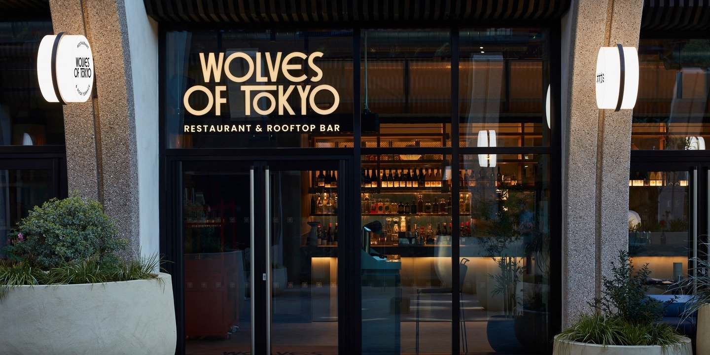
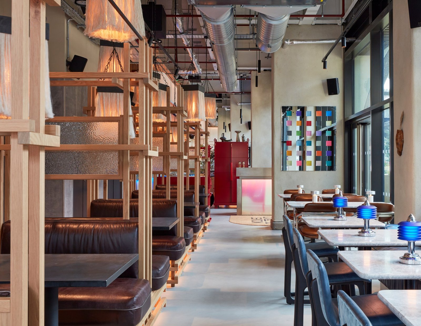
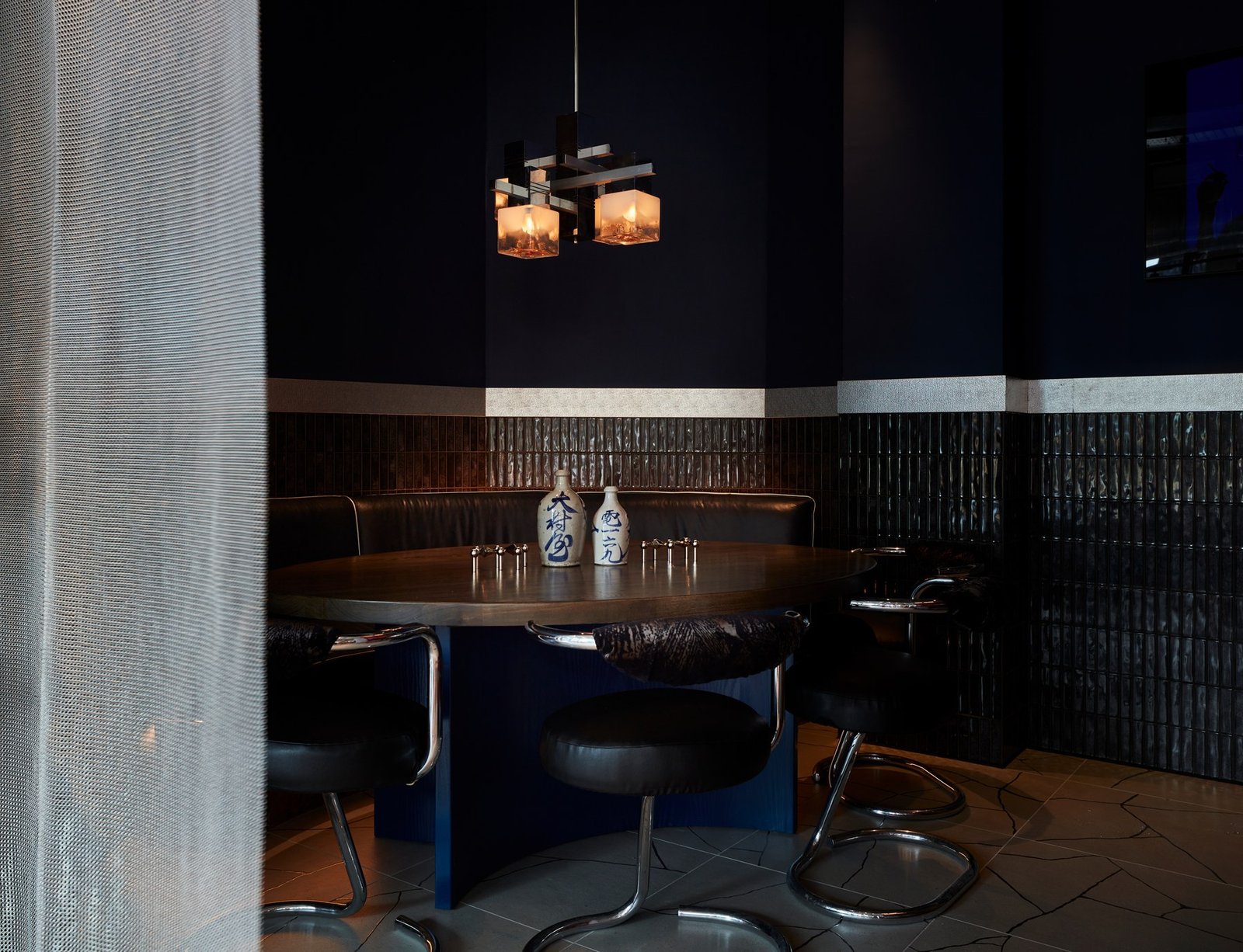
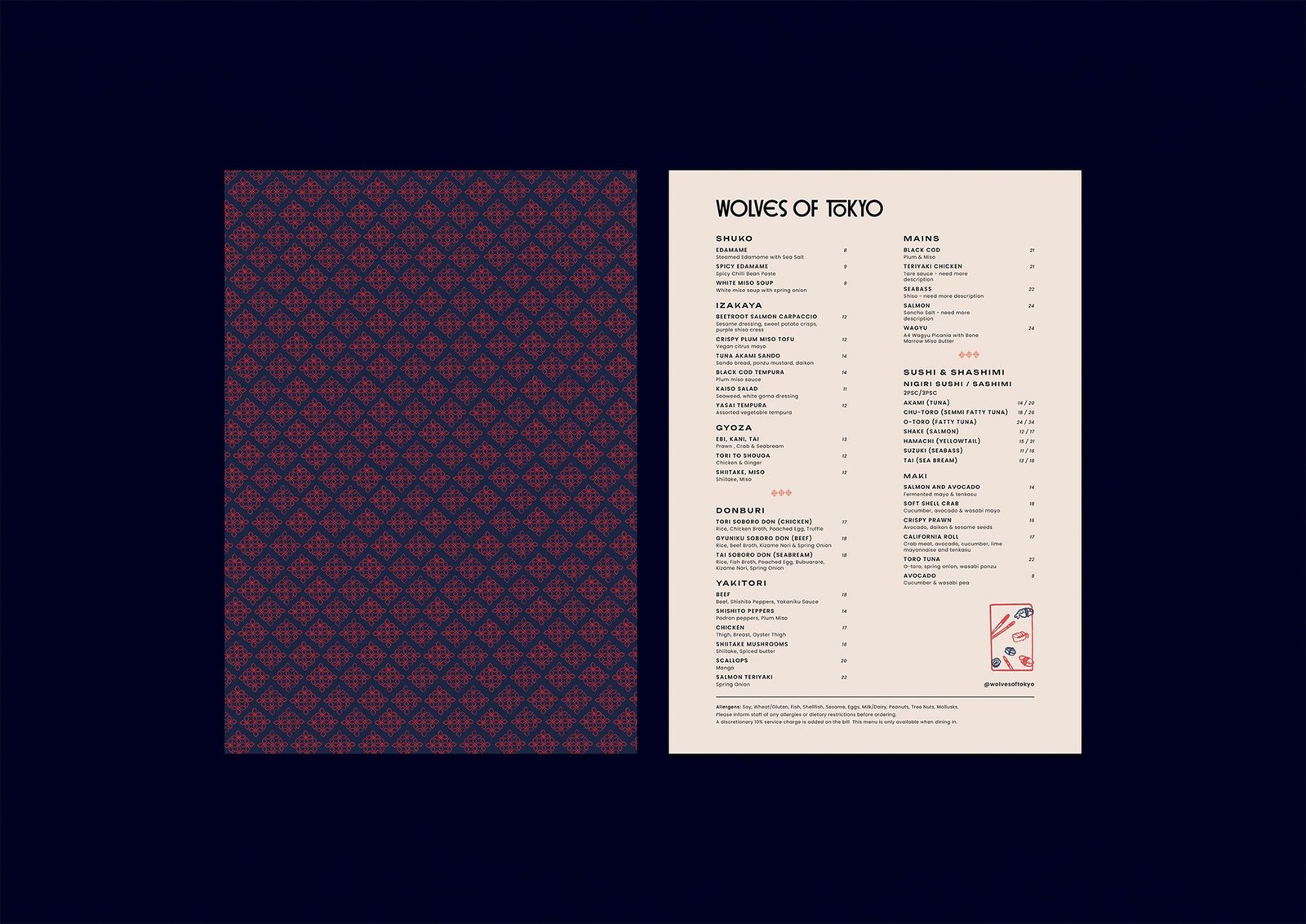
Wolves of Tokyo, a Japanese restaurant and rooftop bar at Olympia in London, demonstrates that cumulative approach. During a visit reported by Creative Boom, writer Tom May found the same lacquered reds and midnight blues moving through tables, menus, coasters, washrooms and outside signage. The meal—among it sashimi, karaage, yakitori and a memorable sea bass maki—remained the focus because the design did not compete for attention.
The apparent ease is the result of coordination. Run for the Hills, the studio responsible for the project, treated naming, visual identity and interior design as connected parts of one assignment. That decision offers the most useful lesson here: coherence is not a finishing layer added after the major work; it is produced by making the major decisions together.
Designing the Room and Identity Together
Rather than create a logo and ask another team to translate it into a room, Run for the Hills develops graphics and space side by side. Anna Burles and Chris Trotman established the studio in 2012; Burles directs the interior work, while Trotman leads naming and graphic identity. Their teams can therefore test each choice against both the physical venue and the customer-facing brand.
Trotman told Creative Boom that this parallel process avoids two disciplines moving in separate directions and removes the delay of a strictly sequential handover. The practical advantage is not merely speed. Designers working from one conversation can notice conflicts early, while materials, lettering and atmosphere are still flexible enough to influence one another.
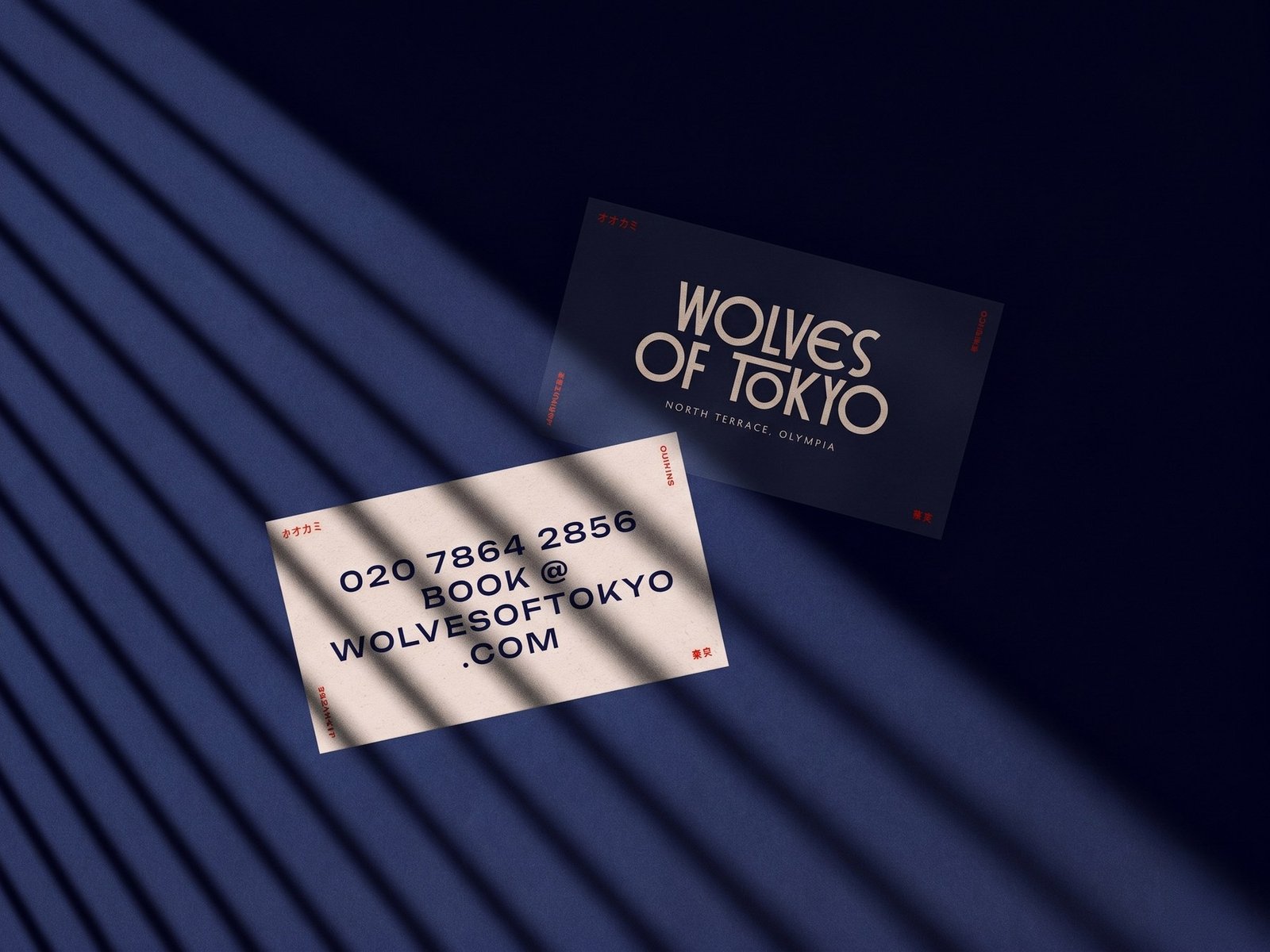
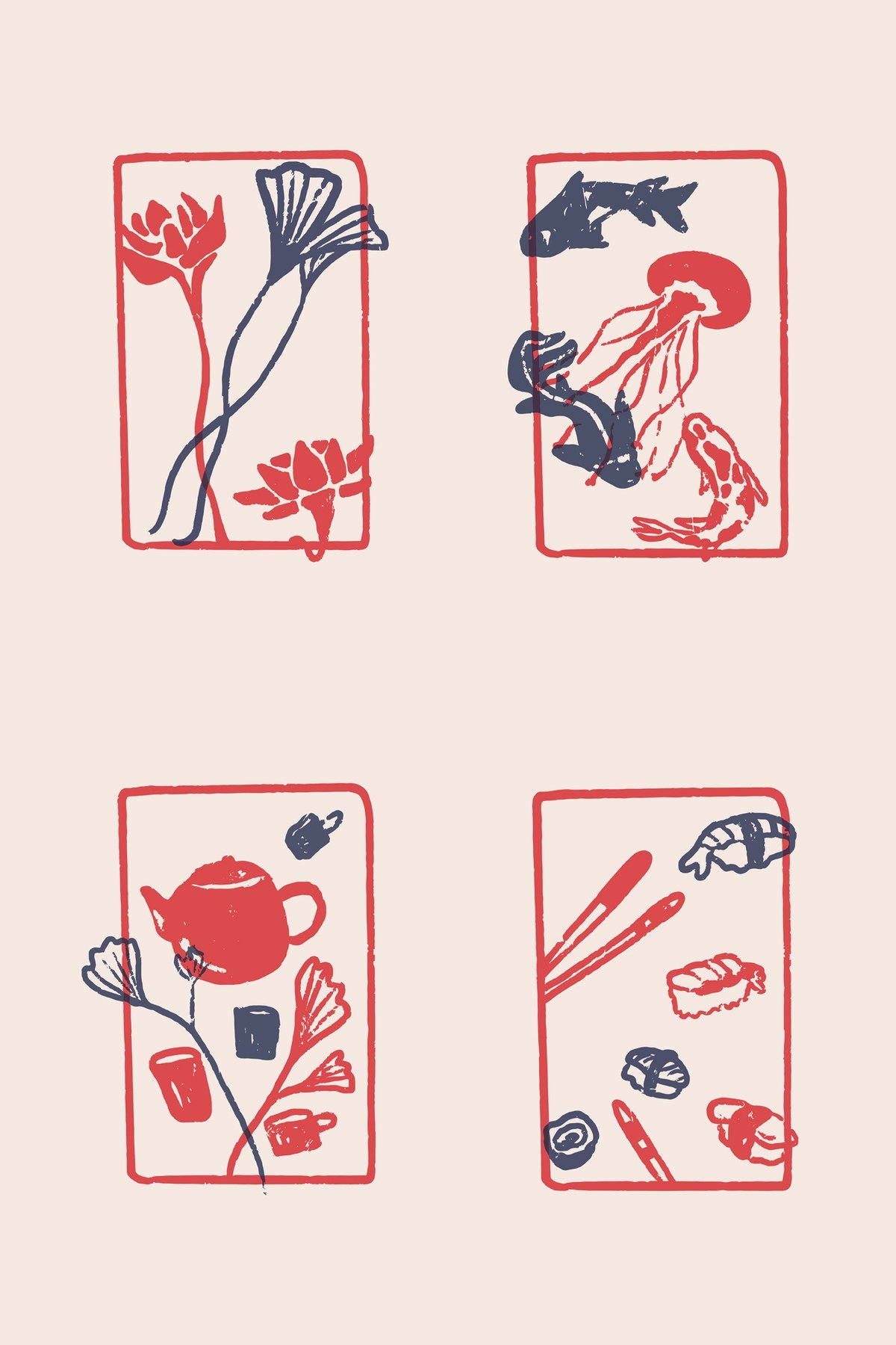
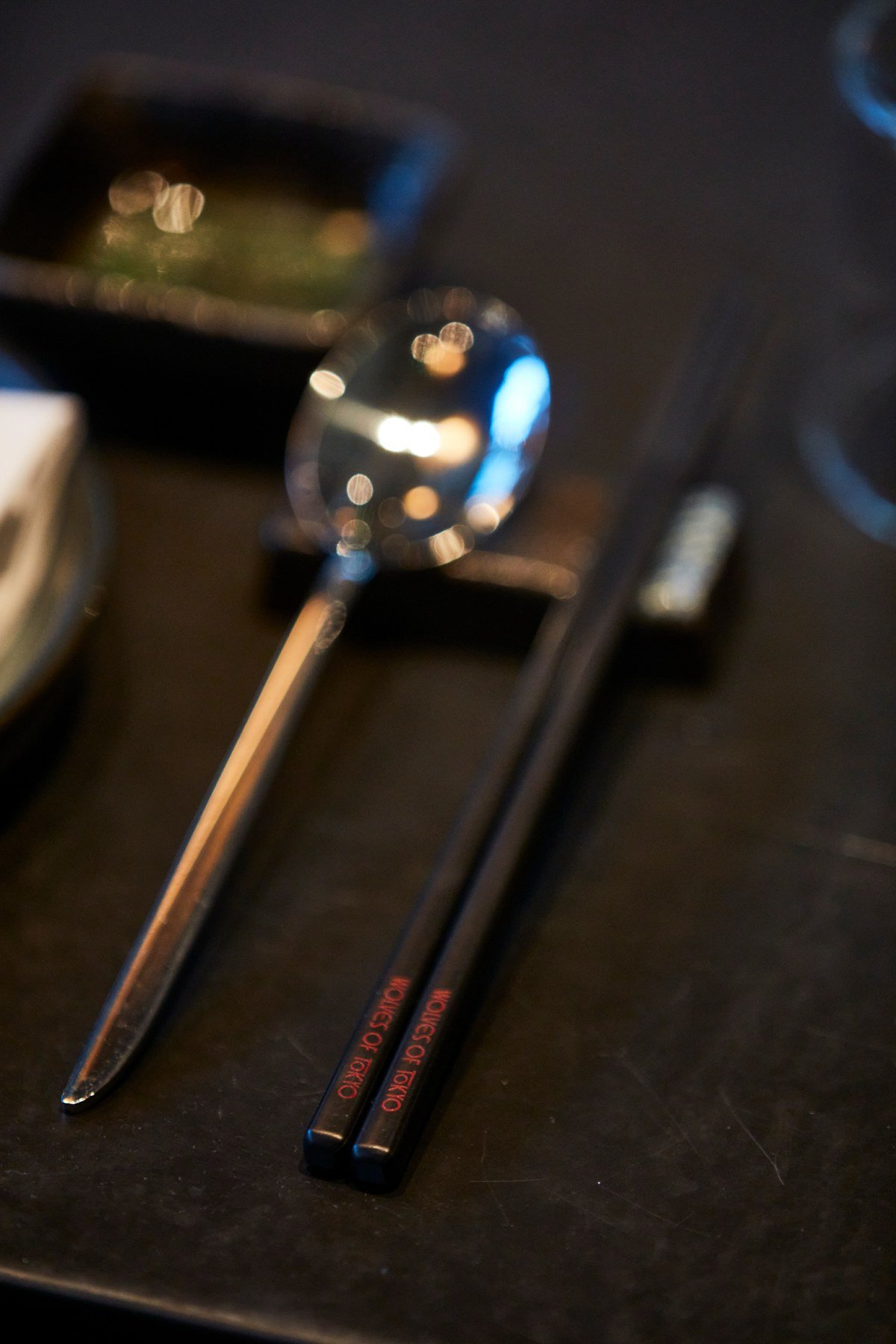
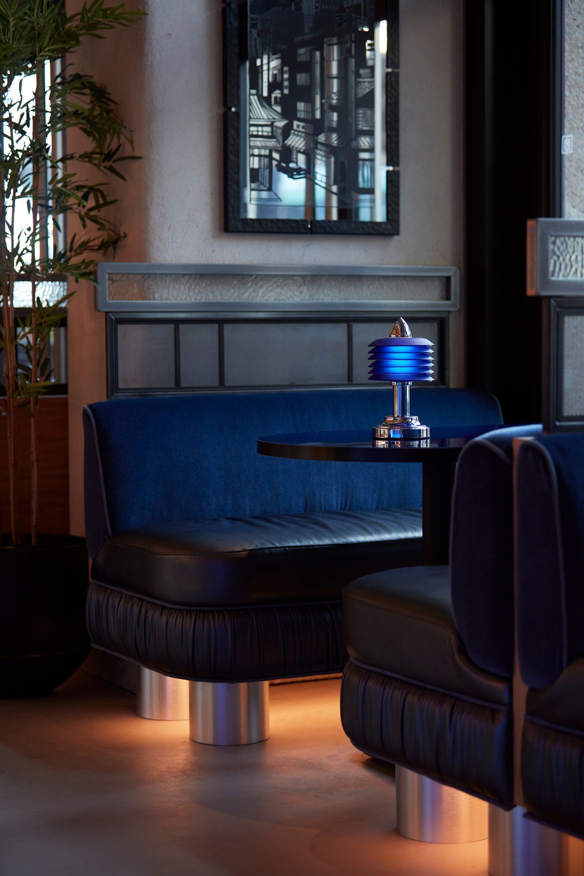
As Trotman described the process to Creative Boom, that exchange is visible in the palette. The blue was not selected for a logo and imposed on the restaurant afterward. He said it emerged from the lacquered tables, while the red drew on bespoke service stations; those spatial decisions then travelled back into the printed and digital identity. Colour became a bridge between disciplines rather than a rule owned by one of them.
The broader principle applies well beyond restaurants. Typography, finishes and colour can become rivals when each is resolved in isolation. When the same group evaluates them as one system, repetition feels purposeful and every element can support the desired emotional register.
A Mood Before a Name
Before the restaurant had a name, the brief already described its cinematic world. Trotman said the team looked toward Japanese films of the 1960s and 1970s, alongside Western noir and the bands of shadow made by window blinds. Deep blue and red were established early, giving later decisions a precise atmosphere to answer.
Starting with tone gave the naming exercise boundaries without dictating an answer. According to Creative Boom’s interview, the team examined restaurant names in Melbourne, Sydney, New York and London, then explored food culture and Japanese expressions. The reported candidates included Neko Noir and Dumplings Over Flowers, which the article glosses as a Japanese expression favouring substance over style. Wolves of Tokyo ultimately became the preferred option.
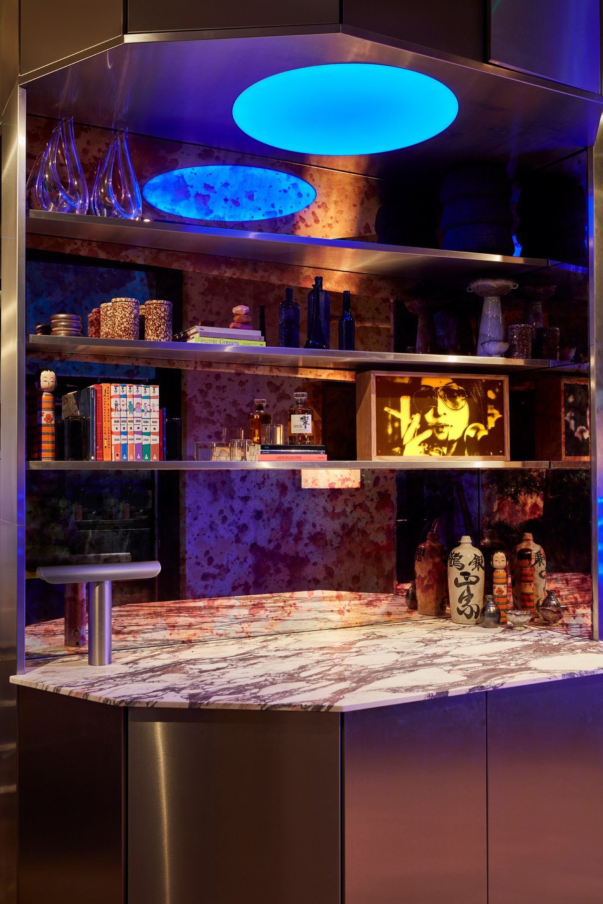
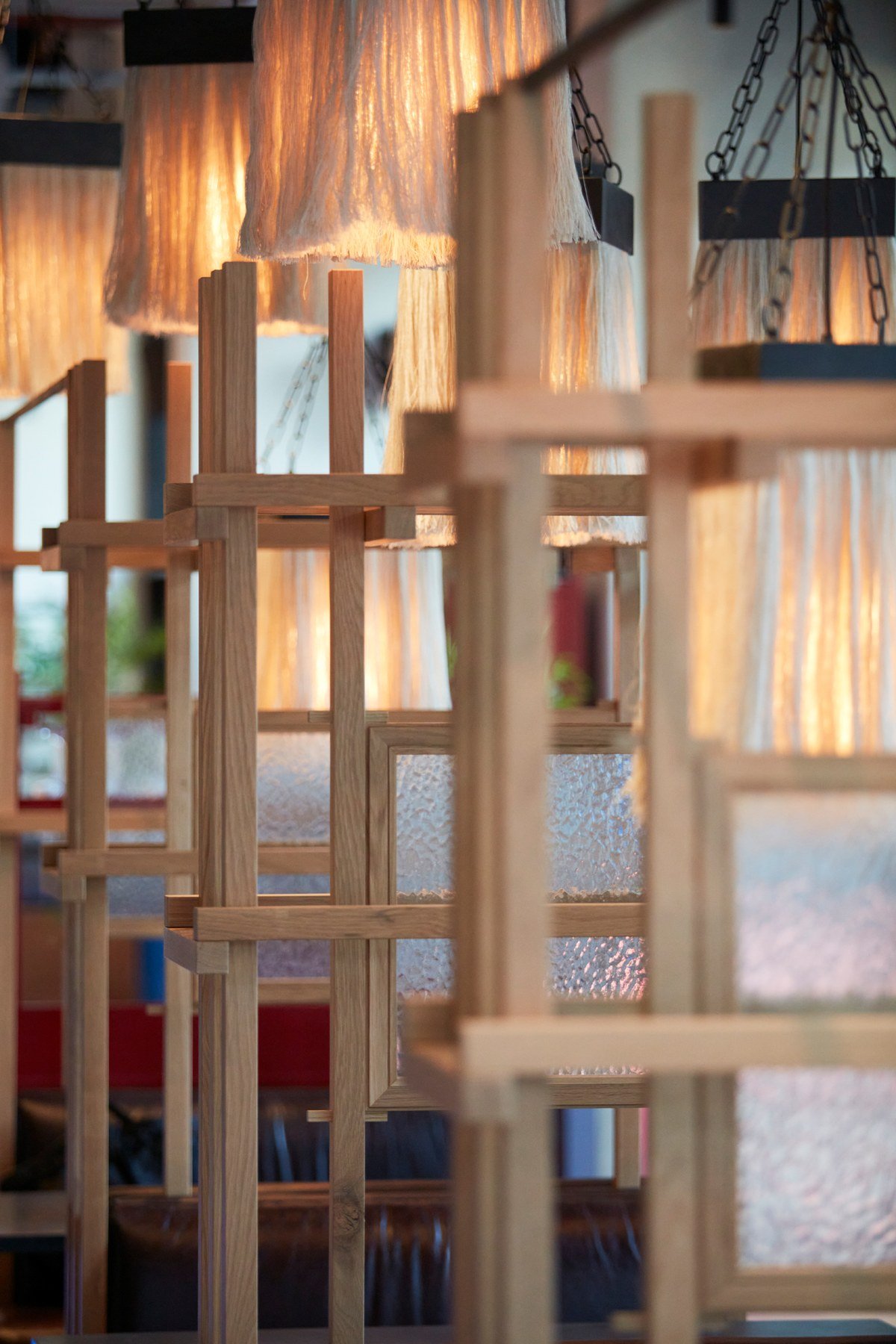
Trotman said the client wanted the cuisine to be legible but rejected familiar shorthand. In response, the designers avoided an obviously Japanese term and allowed cultural references to surface more quietly through crosswork, timber slats, koi, lotus imagery and hand-pressed illustration. The result signals its setting without turning the dining room into a collection of props.
This order of work is important. A name chosen first can force the environment to perform an idea it was never built to hold. Here, a defined mood acted as a filter: possible names, materials and images could be judged by whether they belonged to the same imagined world.
Storytelling for the Second Look
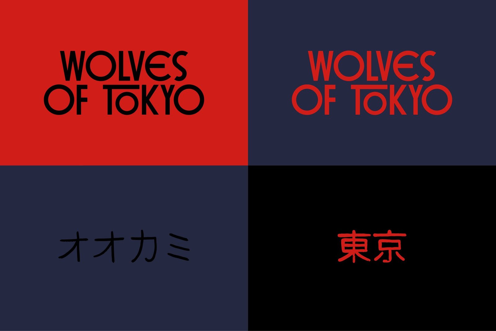
The identity becomes more interesting when it does not reveal everything immediately. A torii form is concealed within the logotype, easy to recognise after it has been pointed out but discreet beforehand. It adds meaning without demanding that the symbol dominate each application.
The studio also devised Lady Zee, the fictional figure who leads the Wolves. Her supposed apartment is the restaurant’s principal private dining room. Trotman characterised the group to Creative Boom not as a violent gang, but as something closer to a youthful, theatrical crew in the spirit of West Side Story. The device gives staff and guests a story to inhabit without requiring literal exposition on every wall.
These discoveries reward attention but do not punish a guest who misses them. That distinction keeps the concept from becoming a puzzle that must be solved before dinner can be enjoyed. Hidden structure gives a brand depth; overt explanation would flatten the pleasure of finding it.
When Every Surface Joins the System
Washrooms are an instructive test of the system because they sit outside the most photographed dining moments. Wolves of Tokyo carries its world into that space with inky tiles, an ivory crackle glaze and asymmetrical mirrors. Trotman argued that guests notice both the care and cleanliness of restaurant bathrooms; treating them as an event keeps the experience intact during the walk away from the table.
When Creative Boom asked what visitors should feel on arrival, Trotman described transportation: the sense of entering somewhere beyond London. Achieving that does not require constant spectacle. It depends on preserving the mood through places and objects that might otherwise be treated as operational afterthoughts.
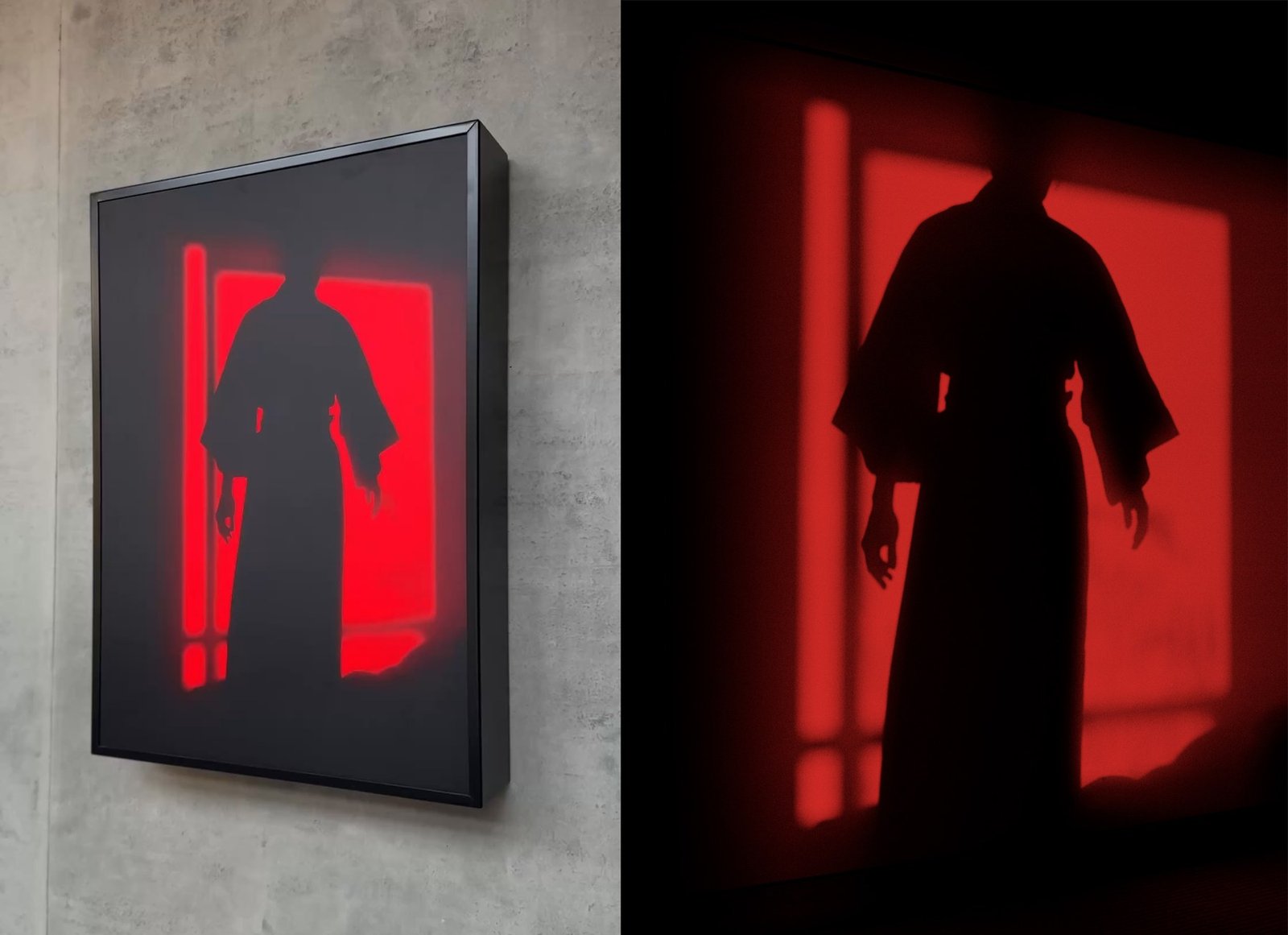
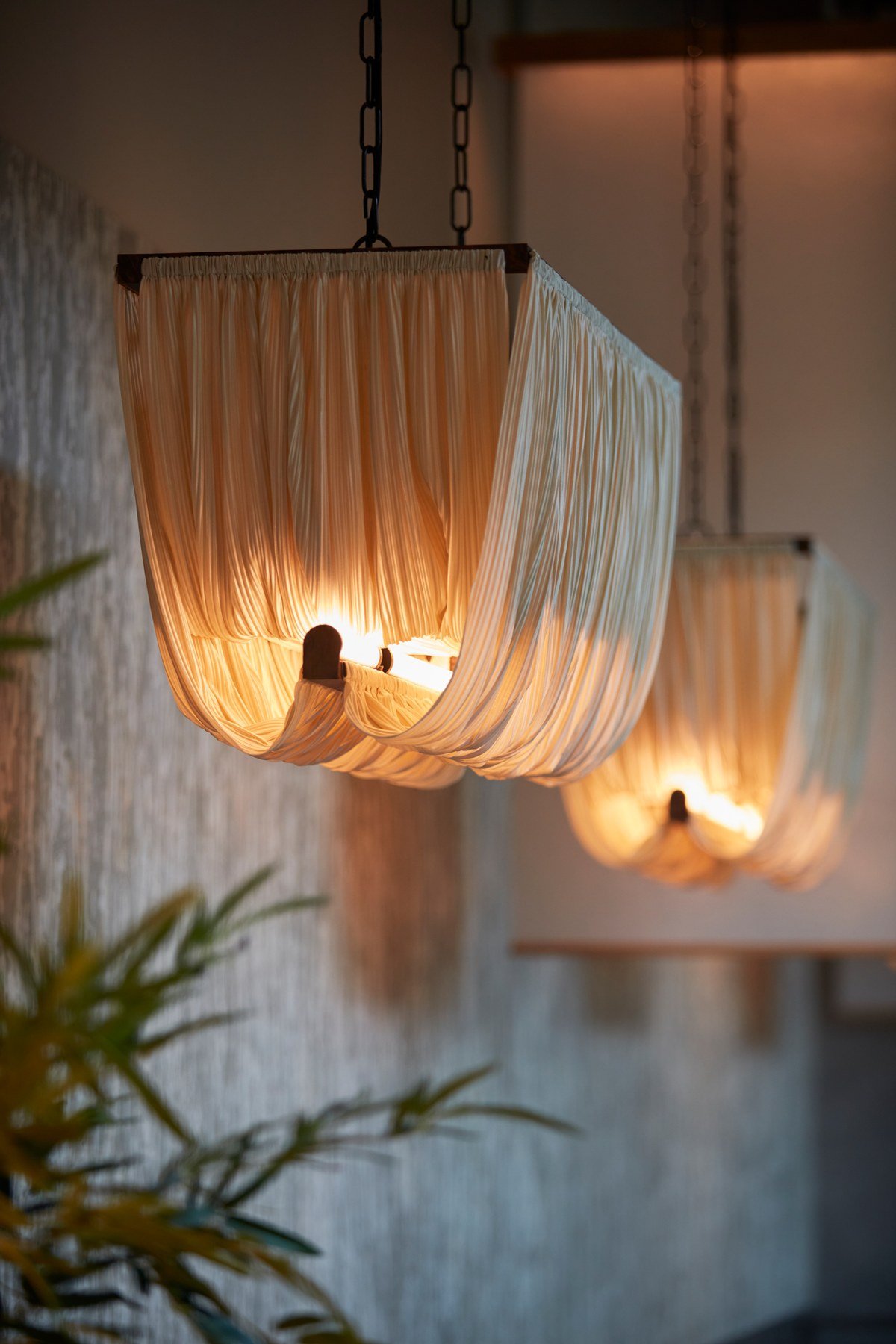
The rooftop venue, Above Wolves, adjusts rather than abandons the identity. Hammered gold and coral make its palette warmer, while the relationship to the restaurant remains recognisable. Downstairs, the system is cooler and more restrained, extending as far as the coaster beneath a drink. Variation works because both settings answer the same premise.
Coordination Is the Lasting Lesson
Trotman calls the approach “invisible branding”: not a campaign of logos placed wherever space allows, but art, objects and interiors developed from shared creative logic. For a contemporary night out, where dining is increasingly treated as an occasion, that consistency helps the venue feel special without turning design into a performance separate from hospitality.
It would be easy to imitate the most photogenic ingredients—the noir lighting, the red-and-blue contrast, a concealed symbol or the karaoke room—and miss what makes them convincing. The transferable value lies in governance: establish an emotional brief early, let spatial and graphic teams work in dialogue, and give minor touchpoints the same attention as prominent ones.
Wolves of Tokyo ultimately succeeds as a design case study because many modest decisions serve one intention. Its world is not built by a single flourish. It emerges through disciplined agreement, repeated until the boundary between brand and place is difficult to locate.