




BRANDING, PACKAGING & HOSPITALITY
WeWantMore’s redesign for Belgian sparkling-water brand BRU shows why the strongest package is not always the loudest one. Sometimes its real job begins after the bottle leaves the shelf.
Packaging advice often starts with the same command: win the glance. In a busy shop, a pack may have only a moment to separate itself from rows of competitors, so designers reach for bold colour, oversized type and instantly legible claims. That logic is useful—but it is not universal.
A bottle ordered with dinner enters a different visual world. It sits among plates, glasses, linen and conversation, often for much longer than it spent in a customer’s hand. In that setting, relentless shelf appeal can feel intrusive. The package has to contribute to the occasion rather than interrupt it.
BRU’s refresh begins with that change of context. Instead of treating sparkling water as another fast-moving product shouting for attention, Antwerp studio WeWantMore designed an object meant to look at home on a carefully set table. The result is a useful reminder that a design brief should describe where a product lives, not merely where it is bought.
A Brand Shaped by the Table
BRU’s own timeline places local bottling in the 16th century and commercial sales in the 17th, centred on the spring at Stoumont in Belgium’s Ardennes. Spadel took over management of the spring in 1981, while the brand continued to build its presence around restaurants and the shared table. Its name derives from the French bruisser—to rustle or murmur—an allusion, BRU says, to the gentle sound of its naturally lightly sparkling water.
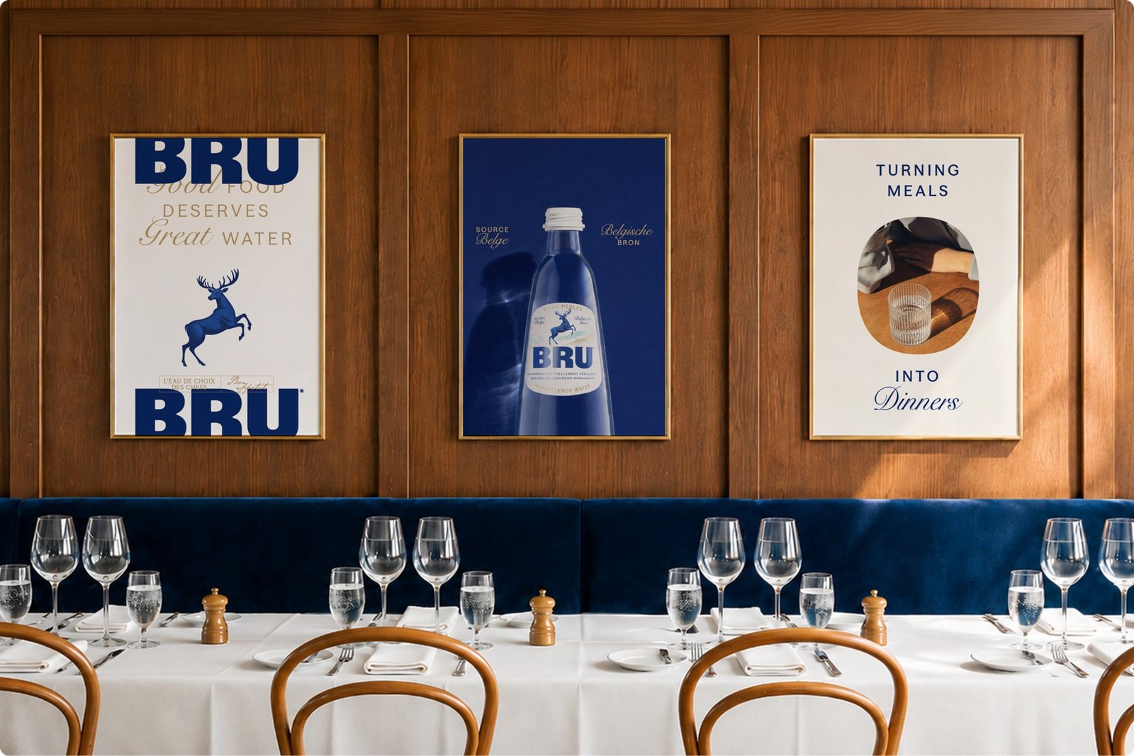
History, however, can lose its energy when familiar cues are left untouched for too long. The design challenge was to keep BRU’s established dining credentials without letting those cues feel static or dated. WeWantMore, founded in Antwerp in 2006, reframed the brand as a finishing detail for shared meals: not simply a dependable restaurant fixture, but an object designed to remain comfortably in view.
Quiet Confidence, Kept Distinctive
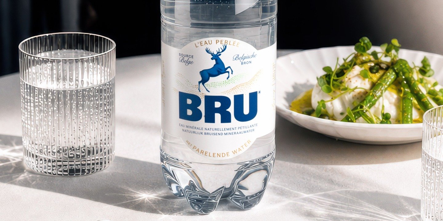
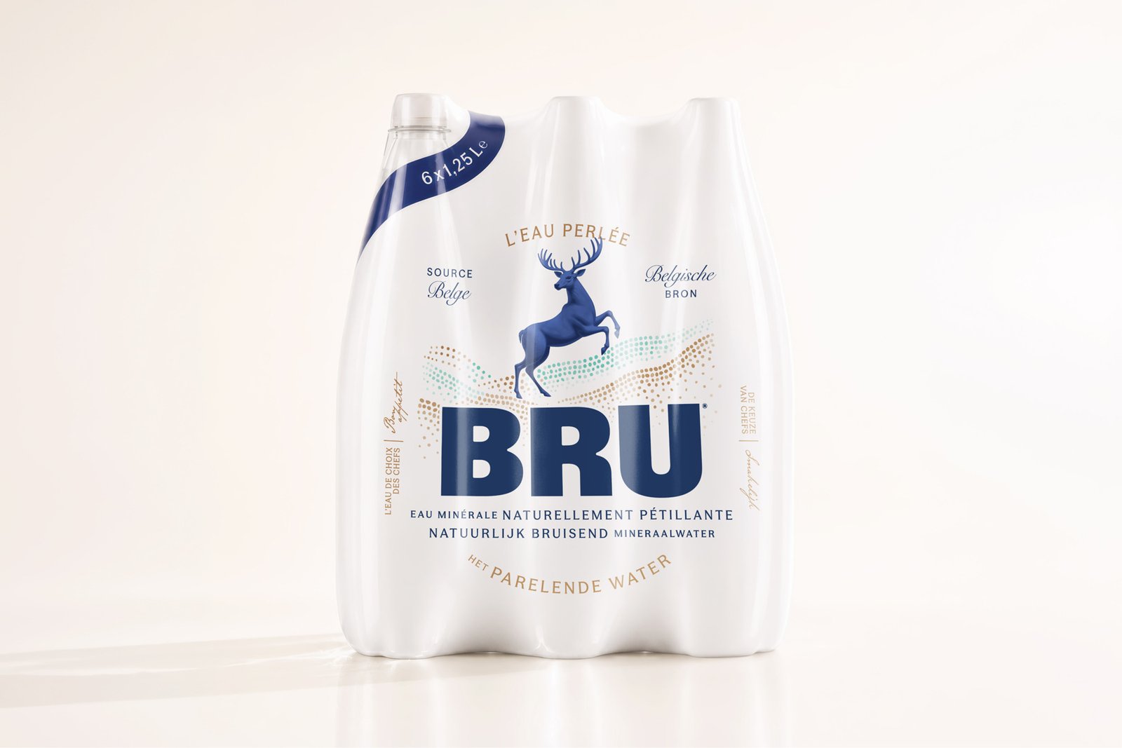
The redesign answers that ambition with restraint. Deep navy leads the palette, suggesting both water and a more composed form of refinement. Generous white space gives every element room, while the clear glass and controlled label architecture feel suitable for a restaurant table without becoming anonymous.
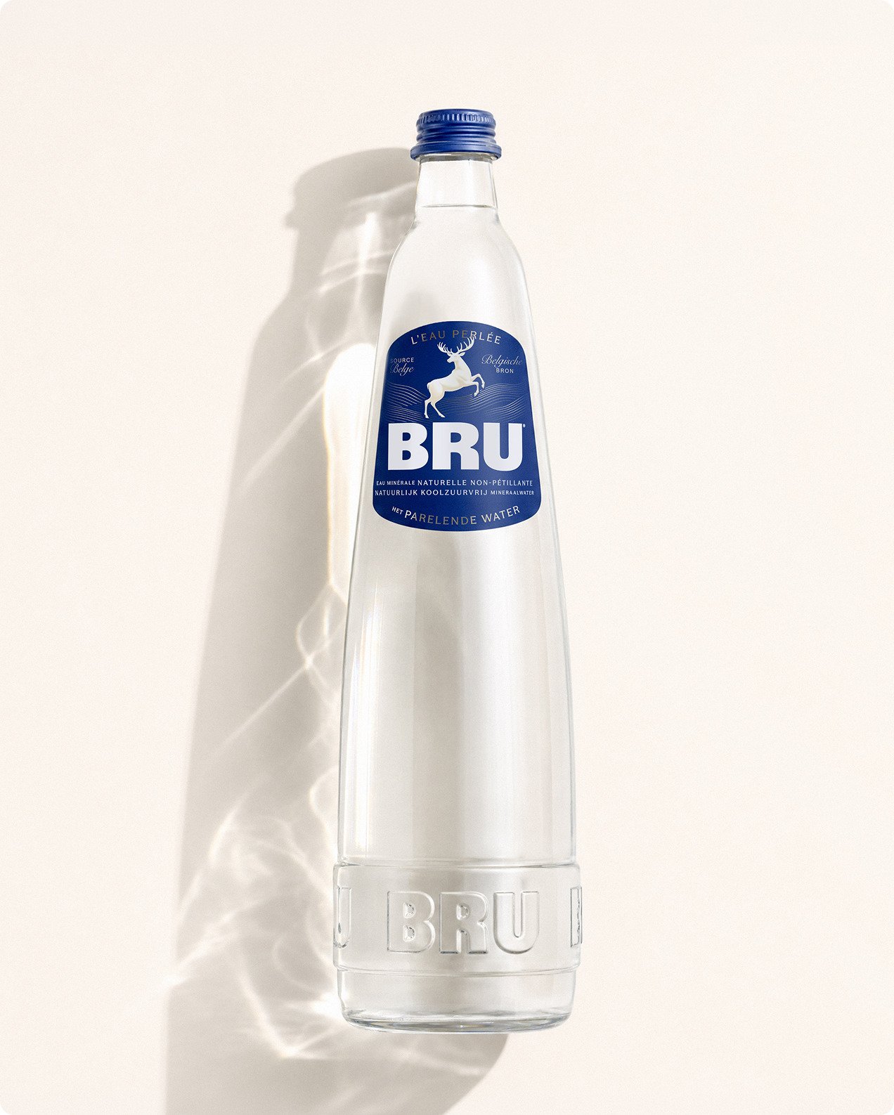
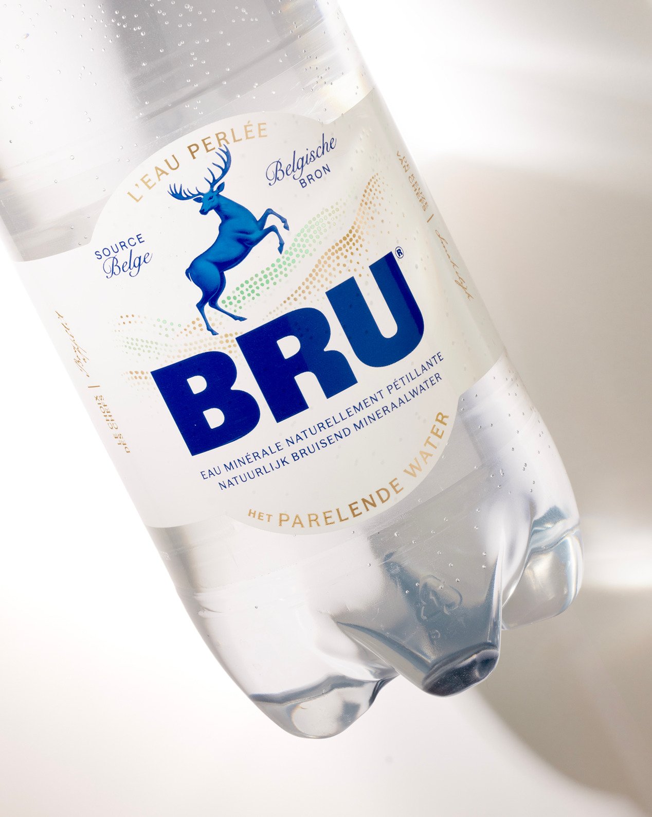
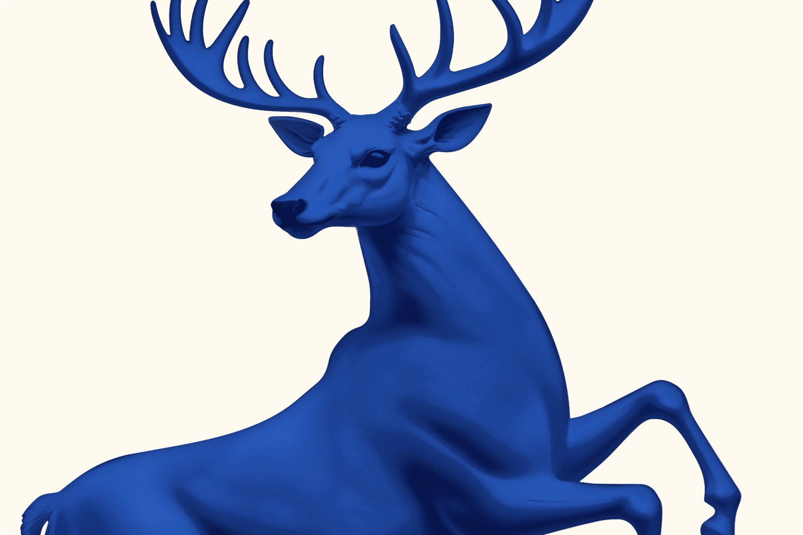
The leaping stag is central to that balance. WeWantMore refined it into a sleek, sculptural emblem instead of reducing it to a generic minimal mark. Heritage is visible, yet the design no longer feels preserved behind glass.
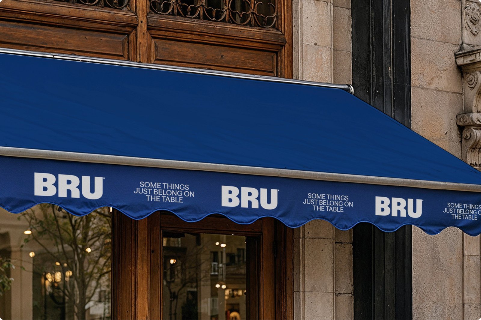
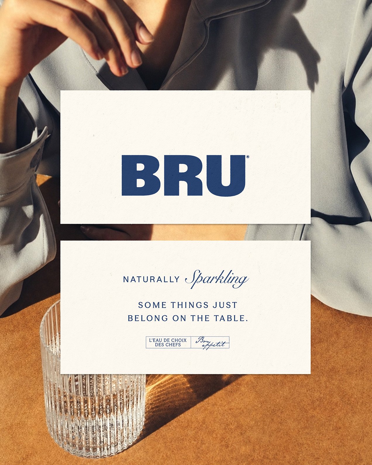
The project line, “Some things just belong on the table,” makes the intended destination explicit. The bottle is no longer judged only by whether it can stop a shopper in an aisle. The design instead asks whether it can sit comfortably beside the food, glassware and people that define the occasion.
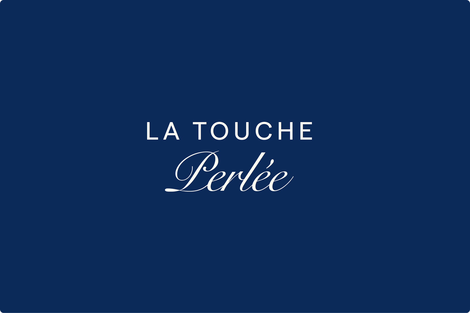
Decorative, colourful lettering adds personality, but disciplined spacing prevents it from taking over. The typography and generous field of blue work together: one supplies movement, while the other keeps the whole system composed.
Start With the Job, Not the Style
The broader lesson is to question the most obvious instruction in a brief. “Stand out on shelf” may sound fundamental, but a product might be selected by restaurant staff, encountered through service, or spend most of its visible life away from retail. Before sketching a logo or opening a design file, teams need to understand the business, audience, route to purchase and setting of use.
The second lesson concerns heritage. Keeping every old detail can trap a brand in its past, while removing every familiar sign can erase the recognition that made the redesign valuable. BRU avoids both extremes. Its stag is neither frozen nor abandoned; it is edited until it can carry the same story in a more contemporary voice.
That middle route demands more judgment than either cosmetic preservation or a total reset. It asks designers to identify which assets hold real memory, then change their expression without breaking the bond. In BRU’s case, calm colour, confident space and a revitalised emblem work because they serve a precise role: making sparkling water feel like a natural part of the meal.
The design lesson: define the product’s real environment first, then modernise its heritage in service of that setting—not in pursuit of attention for its own sake.